
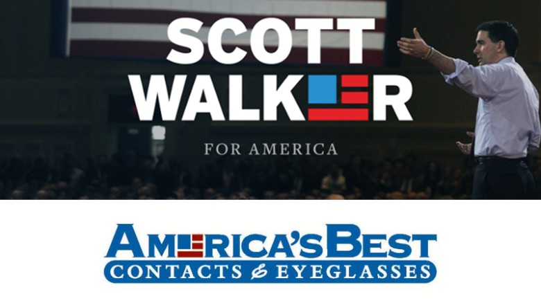
 On Monday night's The Rachel Maddow Show, Rachel pointed out that the new Scott Walker for President logo may be all nice and patriotic, but it's hardly original. I can't find the clip from the show, but I can show you the ones it seems to be inspired by. The logo looks like a direct steal from an eye care company. And as a graphic artist who specializes in logos and brand identity, I've got to say that using the "e" in Walker is an odd place to drop the logo in the first place. But it's understandable to want flag imagery, and there are only so many ways to represent Old Glory in a simplified "bug."
 But how funny is it, that Walker's logo also looks like the logo of former liberal talk radio flagship for Air America Radio, WLIB? That right there is kind of hilarious. But if recent history is any indication, even a controversial logo (Hillary Clinton, Ted Cruz) will probably be retained by the candidate, despite any argument to change it. There's too much invested in the design. Even if it kind of looks like the logo for US Airways.
[Excerpt]
Eyeglass company: No Scott Walker endorsement in logo
 America's Best Eyeglasses is reminding people that their logo may look like Wisconsin Gov. Scott Walker's new campaign logo, but they're not endorsing him, or any other candidate for that matter.
A handful of angry tweeters pressed the eyeglasses and contacts company this past weekend, after Walker revealed a campaign logo that looks very similar to the their boxy American Flag-redux logo. . .
America's Best Eyeglasses is reminding people that their logo may look like Wisconsin Gov. Scott Walker's new campaign logo, but they're not endorsing him, or any other candidate for that matter.
A handful of angry tweeters pressed the eyeglasses and contacts company this past weekend, after Walker revealed a campaign logo that looks very similar to the their boxy American Flag-redux logo. . .Read more at: CNN

The "O" in Scott or the double "TT" would be a better target for a decent graphic... Hell you could just throw a star in the O & do better. Current logo is lazy & lacks any sort of creativity (besides obviously being stolen).
ReplyDeleteThis newer(ish) generation seems to be all about short routes & handouts.