
Image from source, Under Consideration
You might not always be able to tell from this blog, but I'm a graphic artist. In my real job, I'm often required to create logos for companies. Sometimes they are brand new logos, and other times, they are refreshings or complete overhauls of existing company logos. It's one of my favorite things to do at work.
So, I tend to notice when a major brand name changes its logo. Sometimes they are bad (Dairy Queen's swooshes), sometimes they are good (Xerox's new logo), and sometimes they don't make much difference either way. I suspect to most people, Pepsi's new logo is no big whoop. To me? I find it irritating, especially the fact that a logo designer probably got paid a hefty amount to come up with it.
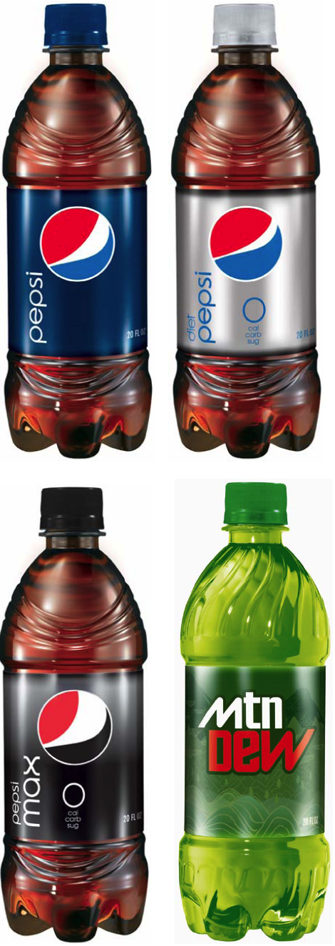
Pepsi's new logo features a twist on their old "Pepsi ball" with a typeface from the 70s. I won't argue with the font, other than to point out that it looks like the old "Pepsi Light" logo. It's the ball that bugs me. The old ball was an evolution of the original script Pepsi logo of the 1800s. The script had a wave to it, which was used many years later to make the "yin and yang"-type shapes that eventually became the ball. The new ball on the other hand, seems to be made of random shapes. It looks like what you might mock up if you wanted to show a soda on TV, but didn't want to feature the brand.
And, it looks like a guy in a red shirt and jeans bending over. This idea is reinforced when you see that the "muffin top" grows on the the full-sugar Pepsi, versus a smaller one on the Diet Pepsi!
 It reminds me of the old Superman movie, where all of the Kryptonians had symbols on their chest, made up of random shapes. Only Marlon Brando's Kal-El had a symbol that reads (to most people) as an "S." I'm told that some people don't see the red "S"on Superman's costume, they see the yellow shapes inside. That is probably why the rest of the logos in the movie had random shapes, and that might also relate to the new Pepsi logo. Maybe the designer didn't know what the swooshes were for? Maybe he just saw random shapes?
Found at: Under Consideration
UPDATE: Since I posted this, I've found several other referrences to the new Pepsi "butt crack." And here, I thought I was original. Here is one of many: AdLand
I also find the new logo irritating but in the sense of artistically it has no new quantum other than small changes which only aggreviate the eye instead of pleasing it. If a logo is going to change it should atleast be pleasing to the eyes and be of significants otherwise why change it to begin with.???? Give me a lump some and my son could do the same with crayons and probably come up with something better for a Pepsi logo. LOL but true. I challenge PEPSI to this for half the money they paid for their new logo.
ReplyDeleteI've seen a few cartons of the new Pepsi logo on the grocery shelves, mixed with the old logo. I'm more convinced that this is not an improvement. I'm curious to see the new Pepsi Lime, Pepsi Twist, Diet Pepsi Jazz, and other product labels.
ReplyDelete