Showing posts with label Graphic Arts. Show all posts

Sunday, March 24, 2013

The Mac Experiment, Continued: The Cult of Mac is Trying to Convert Me. . .

No, nobody knocked on my door. They didn't stick a pamphlet in my door, or hang a tract on my gate. But the Apple Cult is working its magic on me. It's a slow creep, and it's taken 2-1/2 years, but I have to say, I'm at least partially in their thrall this week.

Last week was a different story--as I related here at the time--when my second (admittedly used) Macintosh laptop experienced a useability problem. My first try at the iUniverse was a PowerBook G4 that was insufferably and unusably slow. My second was a decent MacBook Pro (first generation), that had a video card meltdown. I was essentially the victim of an unrealized, and too late recall. And so, my little experiment in dabbling in the OS X side of things--while keeping my PC/Windows 7 main system--had experienced its second major roadblock.

Noooooooooooo!
The first time, I got my used Mac at 5+ years old, and for $300. The second time, I sold the old (plus some other computer equipment), and paid $650ish for an almost 4 year old system, almost breaking even overall price-wise. The third time, I was faced with a $550 repair, and instead bought a third Mac in less than 3 years for $860. This one is 3-3/4 years old refurb, and when you do the math of what it would have cost to fix the old one, plus the $200 I sold the broken one for, I actually came close to breaking even again, and got a newer/better computer.

How much better? Oh-so-much better! I didn't know what I did not know, to paraphrase Donald Rumsfeld. While my first-gen MacBook Pro was plenty useable before its "little problem," it wasn't a) as pretty as this newer one, nor b) as all-around better. I love the keyboard. I love the screen. I love the way the aluminum case looks. It is faster at almost everything. Setting it up right out of the box--and I'm a PC guy used to tweaking and fiddling for hours--was nearly effortless. Though I'm only moderately familiar with where and how to set up Mac stuff, I got all of my info entered and done within minutes. But that's not all.

My software isn't this obscure, but it seems
as unlikely to work on a Mac.
This system came with "Parallels" and Windows 7 installed and ready to go. I use a particular kind of software for my sign graphics business that is PC only. It couldn't possibly work on my Mac, right? Not even with emulation software. Wrong! It runs, and runs perfectly. I was able to copy all of my system files to a USB thumb drive, copy them over and set them up in no time. I was only hindered by the download time for the software, and that was only because I didn't feel like moving from one end of the house to the end my wireless router is in.

Next, I went back to my PC, to get my (very cumbersome, very unintuitive) iOmega Cloud Drive to communicate with the Mac. This is not a PC problem but an iOmega problem (which is now apparently Lenovo EMC's problem, since they've changed hands). Still, once I got the info sent to the Mac, it was smooth sailing. Bada-bing, bada-boom. And the icing on the cake? When I went to set up the MacBook Pro to my wireless all-in-one Lexmark printer? No joke, done in 10 seconds flat.

So now--as long as I'm thinking ahead and take the special USB fob my graphics software needs--I can travel with my MacBook Pro to anywhere in the world, access my files from my home cloud drive, and through Windows 7 work on any of my projects for either of my jobs! I'll never be free from work again! Yay?

Okay, I don't love my Mac this much. . .
Bottom line, this was the easiest setup of any computer ever in my career as "guru." How long until I'm as proficient on the Mac side as I am on the PC side? Soon, I hope. But it's the hardware side that worries me. While it's fair to say that all laptops are a challenge if something goes wrong with the hardware, I'm finding that Macs don't age particularly gracefully, and that Apple kind of washes their hands of them at a fairly young age (the hipster "genius" with the lensless glasses at the Apple Store barely disguised his contempt for my 5-year-old ailing Mac).  So it's not all unicorns and rainbows. Still, I'm impressed, and I have a smile on my face when I use my new(ish) Mac!

Thursday, May 31, 2012

In Case You Missed It: Mitt Romney's "AMERCIA"

One of the bad things about being a part-time blogger with a full-time job, is that I often am doing something else when something I'd normally post happens. The Mitt Romney campaign's AMERCIA gaffe is right in my sweet spot: political flubs by graphic artists.

See, I'm a graphic artist, and if I made a mistake like this at work--usually--it would be no big deal. After all, every job goes through stages: concept, options, prototypes, revisions (revisions, revisions, revisions), with client input along the way, finally only producing the final product with the clients' express approval. Sometimes, there are multiple people signing off! So, if there's a typo on the 1,200-piece order, it's the client's fault! Oh, who am I kidding. . .it's the artist's fault, even when it isn't. No matter how many people signed of on AMERCIA (say it with me in your best Jan Brady voice, "Amercia, Amercia, Amercia!"), it is the artist who took this one in the shorts. And not in a good way.

[Excerpt]


Romney’s ‘Amercia’ and 7 More Political Gaffes Rooted in Technology

Mitt Romney has a technology problem. Not the sort of problem that Rick Santorum had with Google search results, but with his latest app called With Mitt. Apparently, his developers had trouble spelling the word “America.” Whoops. That’s an important word to know how to spell when you’re trying to become a U.S. president. . .

Read more at: Wired

Tuesday, March 27, 2012

Changes at Greenlee Gazette

This is my office right after I moved in in 2009.
I'll post the new move-in when it's done!


Posting has been a little spotty of late for two reasons, 1) the rebirth of my freelance graphics business, Greenlee Graphics, (but more on that later), and 2) the rebirth of Greenlee Gazette's office space. The resulting space will be used by both of course. And the change is mostly cosmetic. The Other Half is a very good house painter, and has done all of that work so far. My job has been moving the furniture, cleaning, buying the paint, and most especially, the new carpet.

My temporary space in the middle of the room.


I only moved into this space at the front of the house a little over three years ago. At that time, we switched the guest room and my office, to give me a more comfortable space, and to get me further away from The Other Half when he has to go to bed early for his job.  Back then, we repainted and redecorated my old space to make a cozy guest room. But we just moved me into the old guest room, and didn't change anything. The carpet came with the house 15 years ago, and has seen better days, so it was time. Also, we removed the last vestiges of our 12-year-old Cat. 5 wired network, and went entirely wireless.

A snarl of wires. . .


Wait, wireless I wish. One of my projects was to reduce the number of wires in my office. So, I removed two network cables. I got rid of one of my printers, that's two cords there. I now have a wireless mouse and keyboard. But even in my temporary setup, there is a snarl of wires under my desk. I have a TV, monitor, printer/fax/scanner, cable modem, telephone, CPU, wireless router and more, most with at least two wires coming out of them. I think hiding them is the best I'll be able to do.


But the resulting work, both on my graphics projects and on the remodel have left me less time for blogging. Or more honestly, less time where I want to blog! So please bear with me over the next two weeks. My target date for carpet installation is April 11-13, since I was told--after it was paid for, naturally--that it is a special order. I guess there's some poor foreign kids furiously poking yarn through mesh. I really shouldn't rush them.

More to come on Greenlee Graphics
Anyway, more details as more happens! And I'll try to keep the blog fresh daily, but maybe not as many posts. Thanks for reading.

Wednesday, February 15, 2012

Sign Humor: Kerning Recognition as Revenge

As a sign maker, one of my dubious talents is kerning recognition, which is being able to see improper or proper spacing between letters. I also can recognize off-center and off-level signage nearly instantly. It doesn't come in handy often, and tends to annoy the production department.

Source: Joe.My.God.

Wednesday, February 1, 2012

Amaze Balls: Inserting 3D Objects Into Existing Photographs

Thanks to my good friend and contributor, Stupid Monkey Planet for sending me this video. It goes to show you, there is no "proof" that is good enough anymore, depending upon your budget and computer talent. It will make conspiracy theorists impossible to reason with.


Saturday, January 7, 2012

Mac Vs. PC, The Experiment Continues

Okay, so I've had my "new" MacBook Pro for a few weeks, and I thought it was time for a status update.

This is a PowerBook and the early Macbook Pro
side-by-side.  They look very much alike,
only with different ports, and an iSight camera
on the Macbook.
A little background first. I've been a PC user/guru for nearly as long as they've been used in the mainstream. It really wasn't until the late 1980s/early 90s--when Microsoft Windows 3.0/3.1 really took hold--that the average American began to become familiar with them. That's when I started to use them for work and that is when I started taking to them like a fish to water. We're talking the days before hard drives, and booting from DOS. Anyway, as Windows grew, and megabytes turned to gigabytes, megahertz to gigahertz, floppy drives to hard drives to optical drives to flash drives to the cloud, I've been a PC.

In my career as a graphic artist, I've been a PC. Haughty Mac users have for years looked down their noses at me, since you "can't do" graphics on a PC. This is hogwash of course. And as a graphic artist in the sign industry (much as in the embroidery world), the PC has always been the platform of choice. CorelDRAW grew up with the PC, as did proprietary sign-making software. I have had no problem doing anything on the PC that a Mac user can do. In fact--in my experience--Mac artist often (very often)--cheat in their drawings, using special effects, extra shapes, masks and other tools to make their drawing look good on the screen or on printed paper, but useless for making a real-world product.

The Adobe CS5 Suite. Pricy.
So, as you can tell, I've had a bit of resistance to accepting the Mac in my PC world. But more and more, I'm finding that I need to use Adobe Illustrator to manipulate other people's graphics. Some drawings in AI (an almost default file format) simply do not translate well when moved into other programs (again, all of those cheats and special effects). My working knowledge of AI is very basic. With my mastery of CorelDRAW and sign software, using AI is painful. It is much less user-friendly, and many of its features seem difficult (backward, in some cases) compared to my second-nature shortcuts and mouse clicks in the other programs. Adobe PhotoShop is even worse in that regard, when Corel Photo-Paint is easy.

But you know what? If I ever need to know AI or PS (or even the rest of the Adobe Creative Suite), I'd be set adrift in an unfamiliar world, despite my 20+ years of computer graphics experience. So, a couple of years ago, I decided I'd better learn, if for no other reason than I'd be able to bring something to my current job, and increase my knowledge for a future one, should I ever need it. I decided that I should buy a used computer with the software pre-loaded, in order to save costs (the Adobe suite costs over $1,000, not counting the computer). And I also decided, it should be an Apple Macintosh computer, since the goal is learning, and because I had no familiarity with it.

The "spinning beach ball of death" A common
problem with my PowerBook. As bad as the
Windows hourglass or blue circle.
After chatting with a friend on Facebook, I found a used PowerMac laptop for $300 with a pre-loaded CS3 suite. Initially, this worked out great. I was able to learn a little of how the Mac OS X operating system worked. I was able to get (somewhat) comfortable with where everything is, and how to do it. I even tried a few lessons with the Adobe Suite. But the machine was infernally slow. It was (to be fair) at the time a four-year-old computer. But, even with my addition of a 1 GB memory stick (bringing it to 2 GB), it was nigh useless for any serious project. Unless I wanted to drive myself mad.

Travis--a teenaged son of a friend and Cult of Mac adherent--reasoned that I couldn't judge a Mac based on an "old" computer. This may be true, but a four-year-old top of the line computer ought to keep up with an even older bottom-of-the-barrel PC. It sure as hell ought to be able to surf the internet without bogging down, and displaying the "spinning beach ball of death" every 10 seconds. Shouldn't it?

Eventually, I had to just throw in the towel, and admit that my old Mac wasn't going to cut it. I never did get comfortable with CS3, because I couldn't stand the frustration. So, I sold the old Mac on eBay (buyer beware!), and bought a newer old Mac. This time, it was a Macbook Pro, with a Core2Duo processor and 4 GB of RAM. I ended up winning an eBay sale, nearly panicking when I did so, not sure I got the right thing. Upon receipt though, I found that I could scarcely have done better. I got the last Mac model (early 2008) before they started making them out of a single piece of aluminum (unibody). It's the top-of-the-line, but "old" enough not to be too expensive.  It's as old as the PowerBook was when I got it, but newer than this here blog is.

As I was hoping, this Mac is not only better, it's awesome! If I had gotten this one the first time, by now I might be a Mac/Adobe aficionado! Though I haven't yet completed a project in CS5 (yes, it came with the NEW suite!), I fully intend to. I'm armed with a stack of OS X Lion and CS5 books from the library. And this time, it isn't going to be torture. The new computer is quite zippy, the memory-hog programs open in seconds. The computer will even reboot in less time than any computer I've ever owned. To date, the "spinning beach ball of death" has only ever spun for a second or two, where it was a continual presence on the PowerBook.

So, maybe I'm a little nerdy and smart like
John Hodgeman, and a little cool and savvy
like Justin Long?
As far as my PC vs. Mac feelings go, I can't say I'm a Cult of Mac convert yet. It isn't better, it's just different. I have a brand new quad-core Dell PC as my desktop setup, and it's is faster, though not by much. I'm still much more familiar in a PC environment, and can "get under the hood" much faster, and with much more assurance. But my MacBook will continue to be my casual use go-to, since it is portable. It will go with me on trips. And I'm no longer soured by the nearly useless experience with the PowerBook. I only worry that this Mac will grind itself to uselessness as it ages. PCs can be re-souped up even in older age to at least be used as internet terminals. I hope this Mac can do the same.

I'll be posting the results of my first Mac graphics experiment (the first successful one, anyway!) once I have it done, hopefully this weekend. If you are a PC who is bi-curious (in the computer world, silly), I can recommend staying away from Motorola-based older Macs, but Intel Core2Duos or above? Go for it! But weigh the pre-loaded software models heavier. As expensive as these suckers are, you'll be discouraged otherwise.

Friday, December 2, 2011

"Women for Herman Cain" are Really Stock Photos

In my line of work as a sign designer, it isn't unusual to use stock photos, though I haven't much. Say you need some gorgeous pictures of specific food items for your buffet signs. Stock photos are the perfect answer. But why do so many politicians and political groups use stock photos? It isn't as galling as The National Organization for Marriage (NOM) using Obama rally pictures as their own, but it's close.

I'd also like to point out the badly kerned "Women" script. Check out where the "o" meets the "m". Sloppy.

[Excerpt]

'Women for Herman Cain' also women for cell phones, laptops, balloons, etc.


Herman Cain has found a way to revive Herman Cain's campaign: "Women For Cain" is an online national fellowship of women dedicated to helping elect Herman Cain as the next President of the United States. "Women for Cain" is also a stock photo festival of the highest order, and we can't resist playing along. . . 

Read more at: MaddowBlog

Friday, November 4, 2011

New GOP Elephant Logo Sucks

Yeah, so for some reason I'm on Reince Priebus' mailing list. And he sent me an urgent dispatch today, holding his oh-so-clever "No-Bama" bumper sticker. But I hardly noticed that, because of the logo at the top. The old GOP elephant has had its satanic upside-down stars for ten years or so, but this one is more demonic. As a graphic artist, I just have to say it's an epic fail. It looks like a first draft idea for one of several logo ideas. You're supposed to throw that one away, if you ever saved it in the first place. Terrible.

Wednesday, January 5, 2011

Starbucks Changes its Logo

Image from source Sydney Morning Herald
I am a coffee fiend, but curiously not a Starbucks fan. I really have nothing against the chain, despite its ubiquity. I just prefer my coffee black: unsweetened, untainted by dairy products, with no frills, foam or dustings of spices. Oh, I can cut loose on occasion, but for the most part, just pour it from the pot, and I'm done. But as a graphic artist who specializes in logo design, I do have an opinion about Starbucks' latest logo revision: it stinks!

Okay, that's going too far. It doesn't stink, but it makes little sense. They basically took the siren/mermaidy thing out of the green circle, colored it green, and removed all the text.  So, it's the same logo, with the outside trimmed off. I honestly can't see an organization as large as Starbucks spending the big money to change all their signage to the new design.  "Hey, let's remove the name of the store from all the signs!" Why, that's marketing genius! Whatever they paid the logo designer was too much (and I'd have done it for half!).

My take is, they won't be using this as their only logo. It's sure to be an alternate logo, one used on some items but not others. The store is going to keep its name for god's sake. And I also predict a return to something closer to the more well known logo at some point. It's just too well known to abandon altogether.

[Excerpt]
Starbucks Stirs Ire With New Logo
Starbucks, the world's biggest coffee chain, has unveiled a new logo that omits its name and the word "coffee", infuriating loyal customers.
The new green logo is essentially Starbucks' representation of a female siren - a half-human mythical temptress who led sailors to their deaths. The change, announced overnight during a webcast of a company meeting, comes as Starbucks is building new billion-dollar brands sold outside its cafes. . .
Read more at: Sydney Morning Herald

Friday, October 1, 2010

Mac Update: My Struggles with "Switching" Continue

I originally wrote a post chronicling my progress learning how to use the Macintosh OS X Leopard operating system, along with the Adobe CS3 graphics suite. But my Mac ate it. Really.  I had links, I had images, about my difficulty transitioning from PC to Mac, how much easier graphics are to create in my CorelDRAW X3 graphics suite, etc.  I pressed "publish" and then went to view my work.  Gone.  Just a headline.  Now that is frustrating. 

I may try again later, but I'm too frustrated to do it now.

UPDATE: Grrrr. I did it again. Typed it all up, inserted pictures--saving along the way--posted it, and it disappeared again. Methinks something is going on here. I may have discovered some sort of blogger bomb in one of those photos I tried to post. I think some experimentation is required.

Wednesday, August 11, 2010

Greenlee Gazette Goes Mac

Okay, as a Mac-O-Phobe, I have to state right out in front that I'm not officially "switching" from PC to Mac.  But I am broadening my horizons, and I am retiring my old (very, very slow Dell Celeron PC) computer to the guest room.  I got the idea one night a couple of weeks ago when the Windows 7 "whited out" repeatedly, and that--originally gorgeous, now merely annoying--blue circle would just spin for no reason.

When this happens, the computer is obviously doing something, I just have no idea what.  My first thought was to drop the computer from an extreme height, enjoy the destruction, and then buy a new Dell or HP to replace it.  Then a bell went off in my head.  Maybe I should consider a Mac.  Not because I hate Microsoft, but because I have zero experience using a Mac, and almost none using Adobe graphics products.

Now, I have no intention of quitting my job, especially in this climate. But I realized that I'm wasting away my (mandatory) Fridays off, and that I should probably find a project. What better way to exercise my brains, gain some knowledge and experience, and boost my resume than to learn how to do graphics on a Mac?  It could even help me with my current job, should we receive a file in this format.

But I didn't want to just run out and buy a new MacBook. That's an expensive experiment.  So, I put up an inquiry on Facebook, and very, very quickly got a response from my friend Tracy. She knew a guy (my new friend Ron) who had a PowerBook G4 for sale. After some back-and-forth messaging, and some advice from friends, I decided to go for it. Especially when I found out it was affordable, and included all the Adobe and Microsoft software I'd need to really complete my experiment! Woo-hoo!

Ron did a great job packaging the Mac up, and it was no problem to set up. There was a slight worry when I ran a software update, which took way longer than I thought it would.  But after that, it was easy-breezy. I'm using it now!

I know that beyond upgrading the memory, this machine is maxed out. Apple no longer updates their MacOS X for this model.  And yes, my friends Travis and Stupid Monkey Planet warned me about that. But this is just to get my feet wet, and my brain acclimated.  Once I'm fluent in MacIntoshese, maybe I'll jump in with both feet. But if anyone ever sees this blog become an affiliate of The Cult of Mac, send in the anti-cult brain-unwashers for me, okay?  I don't want to become a shill for any corporation!

I'll probably get some more RAM for it, just to max it out to its limit. And I'll have to learn (and unlearn) tricks and shortcuts (such as a keyboard shortcut for italics and bolds, etc.), and learn about the file structure and differences from Windows. But I thank Ron and Tracy for this chance to embiggen my brain!

Saturday, July 24, 2010

Puzzling Products: Asian Helper?

Last week, I was sent on a mission with a fistful of coupons to score some deals at the neighborhood grocery.  Not being the kind of guy who usually remembers to use coupons before they expire, I was given explicit instructions by The Other Half to get this stuff before the 3-day sale was over.  On the list was any of a selection of "Helper" products by Betty Crocker.  Now, we're usually from scratch cookers, but it is nice to have some packaged stuff on the shelf for when you're feeling kind of lazy.

When I got to the store, I noticed that the Helper products have gotten new packaging recently. As a graphic artist, I often pay attention to new packaging, observing the gradual or even drastic changes that are made to familiar products.  Sometimes they do it to update a stodgy image, sometimes they revert to a "retro" look.  The Helper line just got kinda weird.

Hamburger Helper was introduced way back in 1971, kind of the heyday of packaged, instant dinners.  Usually, the package includes a starch (dehydrated potatoes or pasta), along with a dehydrated sauce packet, and sometimes a topping packet.  "Hamburger Helper helped her hamburger help her make a great meal!" was the slogan, and the cute little four-fingered hand character helped sell it.  Eventually, Tuna Helper and Chicken Helper joined the lineup, along with other spinoffs.  But in the name, you had the basic thing the product did:  help hamburger, help chicken, help tuna become something interesting for dinner.

The new designs just sound weird to me.  For instance, one package I bought was called Wholesome Hamburger Helper Stroganoff.  "Hamburger" looks like an afterthought on the package, making it read "Wholesome Helper."  WTF?  It helps wholesomeness?  It gets worse.  The other package I picked up was called Asian Chicken Helper Chicken Fried Rice.  Which of course reads "Asian Helper."  On first glance, it sounds like Mrs. Livingston from The Courtship of Eddie's Father in a box!  Or, if your mind goes to the weird places mine does, if Hamburger Helper makes hamburger taste good, Asian helper makes ASIANS taste good!  Mmmmm, braiiiins!

I went to the website, and found out that they have all sorts of cumbersome product divisions these days, from Wholegrain Helper to Mexican Helper which probably makes John McCain and Lou Dobbs very, very nervous.  On the whole, I think I'd dub this redesign an epic fail.

Friday, April 23, 2010

The Chicken Logo, and a Few More Potential Logos to Replace the Elephant


Recently, I created a chicken logo for Nevada candidate for Senate (and Harry Reid nemesis) Sue Lowden. She's the goofy lady who thinks the answer to health care is to pay cash, or barter such items as chickens or manual labor at the doctor's office.  After making the logo, it occurred to me (I'm a sign maker and logo designer) that the GOP has lots of options if they want to try something besides their old elephant.  After all, their base has now accepted "tea partier" rather than Republican as their political identity.  And what the hell is with those upside-down stars, anyway?


Sunday, April 18, 2010

Changes at Greenlee Gazette


I decided to try out a new Blogger template, and have been spending the last hour or so attempting to tweak it. I've had difficulty with the width, and with getting the logo to fit properly. Then, I had trouble getting the Facebook share tool in there. And finally--at least in Internet Explorer 8--I'm having trouble with YouTube. The video pops up, but then disappears. It would seem that it still plays, it just does not preview. Which looks kind of silly, and defeats the purpose.

So, I may have to go back to the old template, provided I saved it somewhere (gulp!). Bear with me.

UPDATE: It would seem that the YouTube problem only occurs when it is in the top spot. That might help me solve the problem.  Now, I'm going to try adding a "below the fold" feature to see if it works.  Let's see. . .

"look for the 'Read More' link at the bottom of the post."

Wednesday, March 17, 2010

Logorama: Best Animated Short Oscar

I'm a graphic artist--which may not be in high evidence on this here blog--so I really dug this cute little movie. Logos come to life! I love it!

Wednesday, August 12, 2009

A Lesson in Conservative "Humor"


Image from source, Free Republic

I've been having a fruitless argument with a commenter on my blog lately. Chief among my frustrations has been with the very odd sense of humor and sarcasm by this particular person. But I'm finding a certain sameness among arch conservatives when it pertains to political "humor." Mostly that it isn't really all that funny.

A lesson any humorist or cartoonist must learn is that if you have to explain the joke, it probably isn't that funny. And a simple turn of phrase or a visual pun must have some sort of relevance to its subject for the joke to work. Now, I'd never claim to be an expert at the craft. I'm sure as many of my snarky attempts at irony and sarcasm have fallen flat, as those that were successful. You can't win 'em all. But it is my aim and hope that readers at least see what I was going for, even if I didn't hit a home run (or even a foul tip).

Conservative humor, in my experience, just comes out mean. And often times raises more "huh?" than "hah!" Take for example, almost anything Dennis Miller has said since he decided to infuse his act with right-wing material. Or the FOX "News" attempt to replicate The Daily Show with the tragically lame 1/2-hour News Hour. Or virtually anything on the page linked to below.

The page I'm referencing is something of a repository for all of the graphic images made by the denizens of Free Republic, the arch-conservative web forum. As you'll see, there are a lot of talented graphic artists over there, and I'm not being facetious. The problem is, they need to be paired with humorists. And the occasional "Buckwheat"-type attempt at humor I think we can all agree, ought to be avoided.

Maybe my new antagonist can explain to me what the joke is behind depicting President Obama as The Joker. I really don't get what the gag is. Does anyone else?

Source: FreeRepublic


Monday, June 29, 2009

Bad PhotoShop Job: FunGuide Racial Diversity


Image from source, National Post

"PhotoShopping" can be a hoot. I've done it for fun, used it for comic effect here on the blog, and use it in my work to superimpose signs onto buildings for customers. Most of what I've done (and I don't even use PhotoShop, I use Corel Photo-Paint) doesn't need to be 100% photo-realistic. But even my goofy attempts are more believable that the one featured in the excerpted article below. It pretty much jumps up and screams "PhotoShop Job!"

[Excerpt]

City digitally adds black guy to Fun Guide cover to make it more ‘inclusive’

The smiling, ethnically diverse family featured on the cover of Toronto's latest edition of its summer Fun Guide was digitally altered to make the photo more "inclusive," which city officials say is in keeping with a policy to reflect diversity. . .

Read more at: National Post

Thanks to Stupid Monkey Planet for the link.


Friday, May 8, 2009

Frivolity Break: Font Fight!

This is silly, but as a graphic designer it gave me a little chuckle. Too bad they couldn't work in Trajan Bold, the movie font though.

Tuesday, December 9, 2008

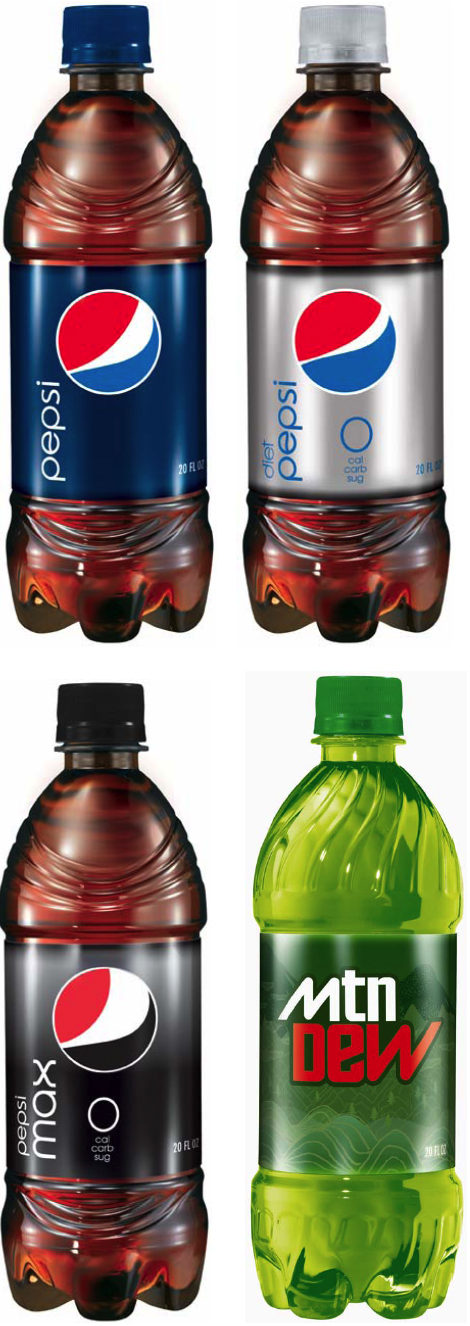
Pepsi Gets a New Look. But is it Improved?


Image from source, Under Consideration

You might not always be able to tell from this blog, but I'm a graphic artist. In my real job, I'm often required to create logos for companies. Sometimes they are brand new logos, and other times, they are refreshings or complete overhauls of existing company logos. It's one of my favorite things to do at work.

So, I tend to notice when a major brand name changes its logo. Sometimes they are bad (Dairy Queen's swooshes), sometimes they are good (Xerox's new logo), and sometimes they don't make much difference either way. I suspect to most people, Pepsi's new logo is no big whoop. To me? I find it irritating, especially the fact that a logo designer probably got paid a hefty amount to come up with it.

Pepsi's new logo features a twist on their old "Pepsi ball" with a typeface from the 70s. I won't argue with the font, other than to point out that it looks like the old "Pepsi Light" logo. It's the ball that bugs me. The old ball was an evolution of the original script Pepsi logo of the 1800s. The script had a wave to it, which was used many years later to make the "yin and yang"-type shapes that eventually became the ball. The new ball on the other hand, seems to be made of random shapes. It looks like what you might mock up if you wanted to show a soda on TV, but didn't want to feature the brand.

And, it looks like a guy in a red shirt and jeans bending over. This idea is reinforced when you see that the "muffin top" grows on the the full-sugar Pepsi, versus a smaller one on the Diet Pepsi!

It reminds me of the old Superman movie, where all of the Kryptonians had symbols on their chest, made up of random shapes. Only Marlon Brando's Kal-El had a symbol that reads (to most people) as an "S." I'm told that some people don't see the red "S"on Superman's costume, they see the yellow shapes inside. That is probably why the rest of the logos in the movie had random shapes, and that might also relate to the new Pepsi logo. Maybe the designer didn't know what the swooshes were for? Maybe he just saw random shapes?


UPDATE: Since I posted this, I've found several other referrences to the new Pepsi "butt crack." And here, I thought I was original. Here is one of many: AdLand
Related Posts Plugin for WordPress, Blogger...