 |
| The New (ugly) "logo." --from source, Huffington Post |
There is a lot I don't like about the Comcast acquisition of NBC Universal. I mean, NBC Universal was
already the merger of two big media companies. Every network was already owned by a huge conglomerate (Viacom owns
two of them, CBS and the CW). As with seemingly everything else in this country, one of these days, there will probably be only a couple of giant owners, splitting the whole media pie. You can go to any hardware store you want, as long as it's Home Depot or Lowes. Any book store, as long as it's Borders or Barnes & Noble. Any media source, as long as it's DisneyViacomWarnerFox or ComcastNBCUniversal.
![]() |
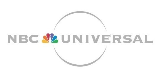
| Previous (better) logo --from source, Huffington Post |
I'm a graphic artist though, so another problem is their hideous new logo. NBC has done great things with logos over the years, with the great brand recognition of their peacock. The previous corporate logo neatly blended the two identities of NBC and Universal. It was cool; simple but classy. The new one? It isn't a logo at all. It's a typeface. And it isn't even an attractive typeface. Somebody gets paid for this stuff? How do you get a gig like that?
[Excerpt]
NBC Universal's New Logo Ditches Peacock
NBC Universal is now NBCUniversal - without the space, the peacock or the globe silhouette.
That was part of the message delivered to the company's 25,000 employees at a town hall gathering on Thursday that featured top executives from prospective new owner Comcast Corp. . .
Read more at: Huffington Post


No comments:
Post a Comment
Have something to say to us? Post it here!