
 |
My logo design for Jeb Bush, provided free of charge. |
So does the author of this article, whose critiques are not only right on the money, but also quite hilarious. And rude. And hilarious.
[Excerpt]
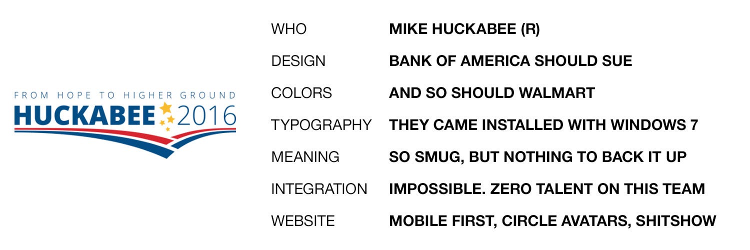
I’ve long held the ridiculously biased and shamelessly partisan opinion that Republican campaigns are…uh…less than excellent at graphic design. I have some theories on why this might be the case, which I will not be sharing. What I will be sharing is my attempt at assessing and ranking the logos of the fourteen (as of June 7, 2015) declared candidates. I have also reviewed all of the candidates’ websites for logo integration and overall design, and oh man do you ever owe me for that. . .
Read more at: Organizer Sandbox
No comments:
Post a Comment
Have something to say to us? Post it here!