Showing posts with label Branding. Show all posts

Wednesday, June 10, 2015

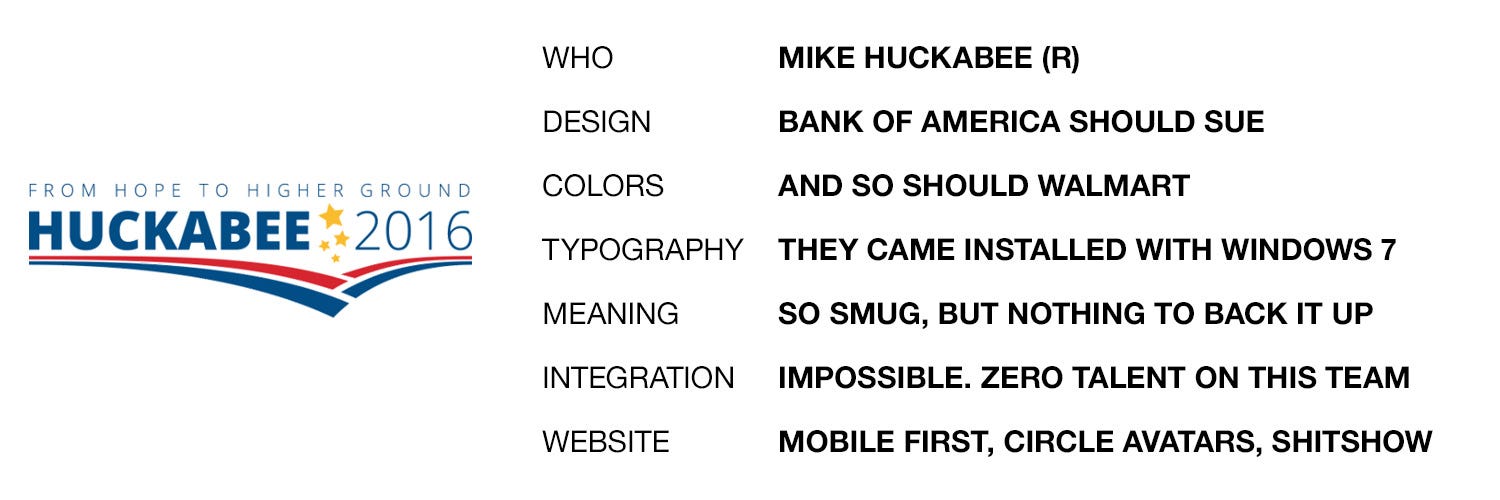
2016 Presidential Logos, Ranked


My logo design for Jeb Bush, provided free of charge.
I love this article. Things don't get more in my wheelhouse than this. I'm a graphic artist, mostly for sign design, but specializing in logo design. Though I have no real formal training beyond a technical college, I've been designing logos and even corporate identities for as long as I've been shaving. Actually longer, predating computer graphics! So, it's kind of my thing. And though I won't tout my own creations as superlative, I do know quality design when I see it, and I know crap.

So does the author of this article, whose critiques are not only right on the money, but also quite hilarious. And rude. And hilarious.

[Excerpt]

The 2016 U.S. Presidential Candidates’ Logos, Ranked.

I’ve long held the ridiculously biased and shamelessly partisan opinion that Republican campaigns are…uh…less than excellent at graphic design. I have some theories on why this might be the case, which I will not be sharing. What I will be sharing is my attempt at assessing and ranking the logos of the fourteen (as of June 7, 2015) declared candidates. I have also reviewed all of the candidates’ websites for logo integration and overall design, and oh man do you ever owe me for that. . .

Read more at: Organizer Sandbox

Thursday, March 14, 2013

Hostess Cupcakes Coming Back?

Image from source, Pink is the New Blog
It's funny how you can miss something you likely haven't bought much in decades, but many Americans got very sad about the demise of Hostess Brands several months back. The Wonder Bread (and other breads) division were gobbled up already, but the Twinkies and Ho-Hos have been mia ever since. And in the meantime, other companies have really stepped up their game, notably Tastykake and Little Debbie, which has packaging very much like just about every Hostess Brand, prominently displayed where the Ding Dongs used to be!

Well, move over Debbie (you vulture), Hostess is coming back!

[Excerpt]

Twinkies May Return To Store Shelves This Summer

Remember back in November when we learned the HORRIBLE news that Hostess snack foods was going out of business and would no longer be producing delicious dessert treats like Twinkies anymore? Well, I’ve got some good news for ya. A joint bid by two companies successfully won the right to produce Twinkies and other Hostess snack foods for sale again … which means that “America’s favorite snacks” might be back on store shelves by the Summer! ISN’T THAT THE BEST NEWS EVER?! . . .

Read more at: Pink is the New Blog

Friday, September 14, 2012

USA Today Destroys its Brand

Meh. Click to embiggen. Image from LA Times.

Redesigns of familiar brands are often very dicey. We're not just judging new versus old, we have an emotional attachment to the established design, whether we are conscious of it or not. Sometimes it goes smoothly, as when Burger King updated its image subtly, or when rival Jack in the Box changed theirs significantly. Neither was decried as a step too far.

But often, if the change isn't seen as an improvement, it can be derided, maybe even damage the brand. When Pepsi changed its familiar red and blue yin/yang globe to one that looks more abstract, designers and fans almost universally panned it. The jury is still out on Microsoft's and eBay's new, minimalist logos, but many find them quite boring. And the most disastrous redo was by GAP, which met such hostility with its logo change, that it decided to throw it out, and keep the old one.

The "before" here wasn't a winner either. But the
red and blue globe was a mainstay. Image from LogoTalk.
USAToday should do the same. I realize that in a changing media world, a newspaper must change with the times. And USAToday has been derided for a long time as "McPaper." But tell me, how did their long-time, established design differ from how a typical web page is set up? It already was laid out with news nuggets and charts, and brightly colored eye-grabbers. USAToday was a web page before we knew what they were!

The logo that never was. Image from LogoTalk.
Now? It just doesn't hold together. As a designer, I'd have a hard time ever liking the new design. The logo is NOT an improvement, and its juxtaposition with a Futura Bold decimalized, six-digit date does not read well. It looks like an unfinished pie chart, a placeholder, or part of an ad. Besides just floating there, looking incomplete, the date does not work in this format. First, the decimals are a cutesy, trendy way to write phone numbers these days, I do not know why, but it's true. Also, in the USA, we put the month first, and in other parts of the world they put the day first, so the date will be unclear to many who read it.

Looks like a web page to me. 
On the whole, I declare it a disaster. They've taken away the brand identity, and produced an ugly product that looks like it was rushed out before it was finished. I can't imagine that this tests particularly well, or how they decided it was "better." Different sure, not better. There was room for improvement, and for streamlining, but they took it too far.

[Excerpt]

USA Today launches redesign

The newspaper that introduced the world to the infographic is getting a makeover. Thirty years after the launch of the new national newspaper, USA Today unveiled a new logo, a more colorful look and bulked-up coverage of technology and travel. It also unveiled a digital redesign that gives the news operation a consistent look on its relaunched website and on mobile devices. . .

Read more at: Los Angeles Times

Sunday, July 25, 2010

The Evolution of the Mitsubishi Galant (Fun With PhotoShop)

Last February, I traded in my old 1998 Jeep Wrangler after nine years, for a slightly used 2009 Mitsubishi Galant.  Ever since, almost every time I spy another car like mine, it's an older model.  Something about the original version of my car's current series just strikes me as ugly.

If you know much about cars, you know that every four or six years, if a car is selling well enough, the manufacturer releases an "all new" series with the same name.  Sometimes, the new version resembles the old in some way, and usually it stays in the same size class. Other times, the car changes sizes, appearance, and might even change from a compact to a mid-size. But there's another way to change a car, without going "all new." Usually, in the lifespan of any series, the car will get a "refresh" or a "face-lift."  This usually involves changing headlamps, taillights, bumpers, and even sometimes fenders, trunks and hoods.  While essentially the same car, these new additions can drastically change the appearance of the car.

This is the case with the Mitsubishi Galant.  In 2003--as a 2004 model year--an all new Galant was introduced, moving the car from compact to mid-size.  At the time, Mitsubishi was trying to go for a "family brand"-look, putting a schnoz in the middle of the grille.  I don't think I'm alone in thinking it was a design mistake.  Take a look:


This car looks best in red, so this is the prettiest glamor shot of it I could find.  In other colors, it looks drab and kinda ugly.  Somebody at Mitsubishi must've thought so too, because in 2007, they kept the same car, but gave it a face lift.  Gone is the nose, but remnants of it remained.  The hood still had style lines that pointed to where the nose should be, and the new replacement grille still had a bulge:


Not really much of an improvement, but better for sure.  Somebody must've thought they weren't quite there yet, but there must've been enough life left in the Galant for them to try again. In 2009, they changed the hood, the grille, and the bumper.  All remnants of the schnoz are gone, though--curiously--they never changed the headlamps:


Also in 2009, they changed the whole back end, replacing pretty much everything, even making the back window larger. Here's a shot I've shown before of  my car next to an original series car:


And for comparison, here are both from the front:


While I'm really loving my car, and think it looks pretty great (even better now, with tinted windows), I still think that Mitsubishi missed a golden opportunity here.  And now that the car has gone through seven model years, there will of course not be a chance.  Mitsubishi has ceased production of the Galant, ending with the 2010 year (UPDATE 06/03/12: As of this date, they are still making Galants, with the same platform. Everything is the same, except for a silver mesh grille, and some chrome trim on the side window sills. They keep threatening to kill the Galant, but it is still--nine model years along--being produced).  It isn't surprising either. It landed on the "worst sellers" list for the last couple of years, probably due to almost nonexistent promotion. When is the last time you saw a Galant commercial?

But what Mitsubishi does sell is Outlanders. And Lancers. The sporty Lancer Evolution is a runaway hit.  It didn't hurt that they came up with a new "family look" for their other cars, featuring an aggressive grille that kinda resembles an old-school Cylon, from the original Battlestar Galactica.  I couldn't help thinking, what would my Galant look like if they'd gotten ballsy, and grafted the new look on to the last round of Galants?  Well, I'm a graphic artist, so I thought I'd find out.  Now, don't be too critical. I spent about seven minutes on this. But I'm telling you, I'd so buy this car!


Saturday, July 24, 2010

Puzzling Products: Asian Helper?

Last week, I was sent on a mission with a fistful of coupons to score some deals at the neighborhood grocery.  Not being the kind of guy who usually remembers to use coupons before they expire, I was given explicit instructions by The Other Half to get this stuff before the 3-day sale was over.  On the list was any of a selection of "Helper" products by Betty Crocker.  Now, we're usually from scratch cookers, but it is nice to have some packaged stuff on the shelf for when you're feeling kind of lazy.

When I got to the store, I noticed that the Helper products have gotten new packaging recently. As a graphic artist, I often pay attention to new packaging, observing the gradual or even drastic changes that are made to familiar products.  Sometimes they do it to update a stodgy image, sometimes they revert to a "retro" look.  The Helper line just got kinda weird.

Hamburger Helper was introduced way back in 1971, kind of the heyday of packaged, instant dinners.  Usually, the package includes a starch (dehydrated potatoes or pasta), along with a dehydrated sauce packet, and sometimes a topping packet.  "Hamburger Helper helped her hamburger help her make a great meal!" was the slogan, and the cute little four-fingered hand character helped sell it.  Eventually, Tuna Helper and Chicken Helper joined the lineup, along with other spinoffs.  But in the name, you had the basic thing the product did:  help hamburger, help chicken, help tuna become something interesting for dinner.

The new designs just sound weird to me.  For instance, one package I bought was called Wholesome Hamburger Helper Stroganoff.  "Hamburger" looks like an afterthought on the package, making it read "Wholesome Helper."  WTF?  It helps wholesomeness?  It gets worse.  The other package I picked up was called Asian Chicken Helper Chicken Fried Rice.  Which of course reads "Asian Helper."  On first glance, it sounds like Mrs. Livingston from The Courtship of Eddie's Father in a box!  Or, if your mind goes to the weird places mine does, if Hamburger Helper makes hamburger taste good, Asian helper makes ASIANS taste good!  Mmmmm, braiiiins!

I went to the website, and found out that they have all sorts of cumbersome product divisions these days, from Wholegrain Helper to Mexican Helper which probably makes John McCain and Lou Dobbs very, very nervous.  On the whole, I think I'd dub this redesign an epic fail.

Tuesday, February 3, 2009

How's that Whole Pepsi Re-Branding Going?


A while back, I ran a post about Pepsi-Cola's new logo designs, and my dislike for it. As I pointed out back then--and I found out that it wasn't an entirely original observation--Pepsi's new logo kind of looks like a refrigerator repair man's muffin top.

I've been a Pepsi fan for a long time, though I like Coca-Cola's products too. Over the years, I've had many different Pepsi items, with lots of different logos. Almost all of those logos featured some variation of the famous "yin-yang" Pepsi ball. With the new logo, the old ball is gone, replaced with a very strange looking "smile" ball, with various sizes of grin depending upon the version of Pepsi you're drinking.

I've already given my reasons for disliking the logo. I've even already linked to the page excerpted below, with other peoples' opinions. But since then, there has been a bubbling over (heh) of opinion, most of it overwhelmingly negative. Also included are negative reactions of the new Sierra Mist, and the Mountain Mtn Dew. And they don't much like the new bottle shape, either.

[Excerpts]


"I'm sorry, Pepsi, but I hate your new logo and label design. . .the "Clean" look is "in" right now, but so were bell bottoms, followed by tapered jeans, then it was super baggy. Don't just become "another clean designed brand". Do something new and exciting. These logos are awful."


"Ughh. I kinda like the font, but the Pepsi logo drives me crazy! the white bands are drawn awkwardly- slightly wonky- It looks like first year design student work. The bottle design looks like the gut of a person that drinks their product. ick."

"This looks like bad student mock-ups, and I wouldn't hire the kid."

"I'm sitting here for some god forsaken reason, reading everyone's rants on the logo change...and for the life of me I don't see the f**king smile...really...who smiles like that anyway? And yes, the bottle definately = wrinkly penis!"

"Haha. Nice joke PepsiCO. Now get back to the old design."

Couldn't have said it better myself.

Read (much) more at: BrandNew


Tuesday, August 7, 2007

The Power of Branding: Pavlov's Kids Pick McDonald's


Image from Wikipedia.com

This just made me say, "whoa!" when I heard it on Air America's Rachel Maddow Show this afternoon. Kid's actually think baby carrots taste better, if they come out of a McDonald's wrapper, than a generic one. Mmmmm. . .beefy carrots.

[Excerpt]

Old McDonald's Has A Hold On Kids' Taste Buds, Study Finds

Science Daily — Say what you will, Shakespeare, but a McNugget by any other name is just not as tasty. At least, not to the 3- to 5-year-old set.

Asked to sample two identical foods from the fast-food giant McDonald's, children preferred the taste of the version branded with the restaurant's familiar "Golden Arches" to one extracted from unmarked paper packaging, say researchers at the Stanford University School of Medicine and Lucile Packard Children's Hospital.

The study shows that even young children are swayed by brand preferences. The results are likely to fuel more debate over a growing movement to restrict marketing to kids under 8 years old.

"Kids don't just ask for food from McDonald's," said Thomas Robinson, MD, director of the Center for Healthy Weight at Packard Children's and associate professor of pediatrics and of medicine at the School of Medicine. "They actually believe that the chicken nugget they think is from McDonald's tastes better than an identical, unbranded nugget."

Continue reading at: ScienceDaily.com
Related Posts Plugin for WordPress, Blogger...