Showing posts with label Logos. Show all posts

Tuesday, July 14, 2015

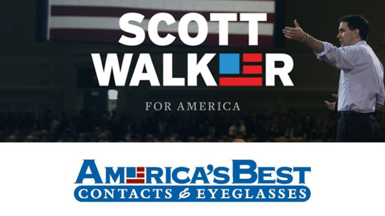
Scott Walker's Logo Lacks Originality, Vision, May Be Too Liberal

On Monday night's The Rachel Maddow Show, Rachel pointed out that the new Scott Walker for President logo may be all nice and patriotic, but it's hardly original. I can't find the clip from the show, but I can show you the ones it seems to be inspired by. The logo looks like a direct steal from an eye care company. And as a graphic artist who specializes in logos and brand identity, I've got to say that using the "e" in Walker is an odd place to drop the logo in the first place. But it's understandable to want flag imagery, and there are only so many ways to represent Old Glory in a simplified "bug."

But how funny is it, that Walker's logo also looks like the logo of former liberal talk radio flagship for  Air America Radio, WLIB? That right there is kind of hilarious. But if recent history is any indication, even a controversial logo (Hillary Clinton, Ted Cruz) will probably be retained by the candidate, despite any argument to change it. There's too much invested in the design. Even if it kind of looks like the logo for US Airways.

[Excerpt]

Eyeglass company: No Scott Walker endorsement in logo

America's Best Eyeglasses is reminding people that their logo may look like Wisconsin Gov. Scott Walker's new campaign logo, but they're not endorsing him, or any other candidate for that matter. A handful of angry tweeters pressed the eyeglasses and contacts company this past weekend, after Walker revealed a campaign logo that looks very similar to the their boxy American Flag-redux logo. . .

Read more at: CNN


Wednesday, June 10, 2015

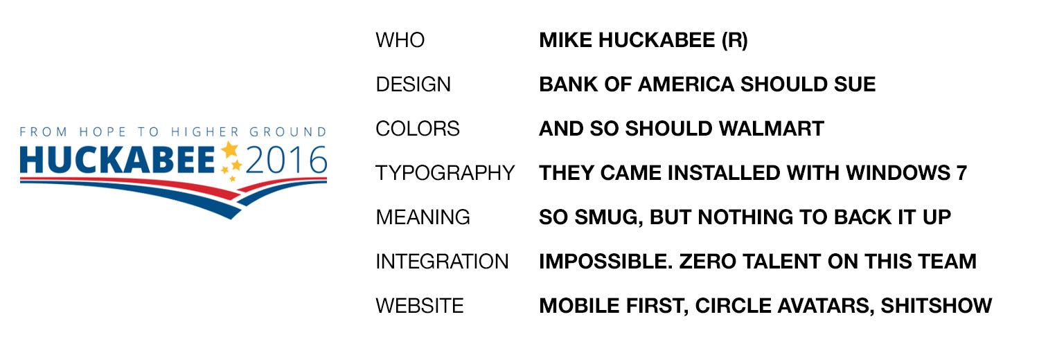
2016 Presidential Logos, Ranked


My logo design for Jeb Bush, provided free of charge.
I love this article. Things don't get more in my wheelhouse than this. I'm a graphic artist, mostly for sign design, but specializing in logo design. Though I have no real formal training beyond a technical college, I've been designing logos and even corporate identities for as long as I've been shaving. Actually longer, predating computer graphics! So, it's kind of my thing. And though I won't tout my own creations as superlative, I do know quality design when I see it, and I know crap.

So does the author of this article, whose critiques are not only right on the money, but also quite hilarious. And rude. And hilarious.

[Excerpt]

The 2016 U.S. Presidential Candidates’ Logos, Ranked.

I’ve long held the ridiculously biased and shamelessly partisan opinion that Republican campaigns are…uh…less than excellent at graphic design. I have some theories on why this might be the case, which I will not be sharing. What I will be sharing is my attempt at assessing and ranking the logos of the fourteen (as of June 7, 2015) declared candidates. I have also reviewed all of the candidates’ websites for logo integration and overall design, and oh man do you ever owe me for that. . .

Read more at: Organizer Sandbox

Friday, September 14, 2012

USA Today Destroys its Brand

Meh. Click to embiggen. Image from LA Times.

Redesigns of familiar brands are often very dicey. We're not just judging new versus old, we have an emotional attachment to the established design, whether we are conscious of it or not. Sometimes it goes smoothly, as when Burger King updated its image subtly, or when rival Jack in the Box changed theirs significantly. Neither was decried as a step too far.

But often, if the change isn't seen as an improvement, it can be derided, maybe even damage the brand. When Pepsi changed its familiar red and blue yin/yang globe to one that looks more abstract, designers and fans almost universally panned it. The jury is still out on Microsoft's and eBay's new, minimalist logos, but many find them quite boring. And the most disastrous redo was by GAP, which met such hostility with its logo change, that it decided to throw it out, and keep the old one.

The "before" here wasn't a winner either. But the
red and blue globe was a mainstay. Image from LogoTalk.
USAToday should do the same. I realize that in a changing media world, a newspaper must change with the times. And USAToday has been derided for a long time as "McPaper." But tell me, how did their long-time, established design differ from how a typical web page is set up? It already was laid out with news nuggets and charts, and brightly colored eye-grabbers. USAToday was a web page before we knew what they were!

The logo that never was. Image from LogoTalk.
Now? It just doesn't hold together. As a designer, I'd have a hard time ever liking the new design. The logo is NOT an improvement, and its juxtaposition with a Futura Bold decimalized, six-digit date does not read well. It looks like an unfinished pie chart, a placeholder, or part of an ad. Besides just floating there, looking incomplete, the date does not work in this format. First, the decimals are a cutesy, trendy way to write phone numbers these days, I do not know why, but it's true. Also, in the USA, we put the month first, and in other parts of the world they put the day first, so the date will be unclear to many who read it.

Looks like a web page to me. 
On the whole, I declare it a disaster. They've taken away the brand identity, and produced an ugly product that looks like it was rushed out before it was finished. I can't imagine that this tests particularly well, or how they decided it was "better." Different sure, not better. There was room for improvement, and for streamlining, but they took it too far.

[Excerpt]

USA Today launches redesign

The newspaper that introduced the world to the infographic is getting a makeover. Thirty years after the launch of the new national newspaper, USA Today unveiled a new logo, a more colorful look and bulked-up coverage of technology and travel. It also unveiled a digital redesign that gives the news operation a consistent look on its relaunched website and on mobile devices. . .

Read more at: Los Angeles Times

Friday, November 4, 2011

New GOP Elephant Logo Sucks

Yeah, so for some reason I'm on Reince Priebus' mailing list. And he sent me an urgent dispatch today, holding his oh-so-clever "No-Bama" bumper sticker. But I hardly noticed that, because of the logo at the top. The old GOP elephant has had its satanic upside-down stars for ten years or so, but this one is more demonic. As a graphic artist, I just have to say it's an epic fail. It looks like a first draft idea for one of several logo ideas. You're supposed to throw that one away, if you ever saved it in the first place. Terrible.

Wednesday, January 5, 2011

Starbucks Changes its Logo

Image from source Sydney Morning Herald
I am a coffee fiend, but curiously not a Starbucks fan. I really have nothing against the chain, despite its ubiquity. I just prefer my coffee black: unsweetened, untainted by dairy products, with no frills, foam or dustings of spices. Oh, I can cut loose on occasion, but for the most part, just pour it from the pot, and I'm done. But as a graphic artist who specializes in logo design, I do have an opinion about Starbucks' latest logo revision: it stinks!

Okay, that's going too far. It doesn't stink, but it makes little sense. They basically took the siren/mermaidy thing out of the green circle, colored it green, and removed all the text.  So, it's the same logo, with the outside trimmed off. I honestly can't see an organization as large as Starbucks spending the big money to change all their signage to the new design.  "Hey, let's remove the name of the store from all the signs!" Why, that's marketing genius! Whatever they paid the logo designer was too much (and I'd have done it for half!).

My take is, they won't be using this as their only logo. It's sure to be an alternate logo, one used on some items but not others. The store is going to keep its name for god's sake. And I also predict a return to something closer to the more well known logo at some point. It's just too well known to abandon altogether.

[Excerpt]
Starbucks Stirs Ire With New Logo
Starbucks, the world's biggest coffee chain, has unveiled a new logo that omits its name and the word "coffee", infuriating loyal customers.
The new green logo is essentially Starbucks' representation of a female siren - a half-human mythical temptress who led sailors to their deaths. The change, announced overnight during a webcast of a company meeting, comes as Starbucks is building new billion-dollar brands sold outside its cafes. . .
Read more at: Sydney Morning Herald

Saturday, July 24, 2010

Puzzling Products: Asian Helper?

Last week, I was sent on a mission with a fistful of coupons to score some deals at the neighborhood grocery.  Not being the kind of guy who usually remembers to use coupons before they expire, I was given explicit instructions by The Other Half to get this stuff before the 3-day sale was over.  On the list was any of a selection of "Helper" products by Betty Crocker.  Now, we're usually from scratch cookers, but it is nice to have some packaged stuff on the shelf for when you're feeling kind of lazy.

When I got to the store, I noticed that the Helper products have gotten new packaging recently. As a graphic artist, I often pay attention to new packaging, observing the gradual or even drastic changes that are made to familiar products.  Sometimes they do it to update a stodgy image, sometimes they revert to a "retro" look.  The Helper line just got kinda weird.

Hamburger Helper was introduced way back in 1971, kind of the heyday of packaged, instant dinners.  Usually, the package includes a starch (dehydrated potatoes or pasta), along with a dehydrated sauce packet, and sometimes a topping packet.  "Hamburger Helper helped her hamburger help her make a great meal!" was the slogan, and the cute little four-fingered hand character helped sell it.  Eventually, Tuna Helper and Chicken Helper joined the lineup, along with other spinoffs.  But in the name, you had the basic thing the product did:  help hamburger, help chicken, help tuna become something interesting for dinner.

The new designs just sound weird to me.  For instance, one package I bought was called Wholesome Hamburger Helper Stroganoff.  "Hamburger" looks like an afterthought on the package, making it read "Wholesome Helper."  WTF?  It helps wholesomeness?  It gets worse.  The other package I picked up was called Asian Chicken Helper Chicken Fried Rice.  Which of course reads "Asian Helper."  On first glance, it sounds like Mrs. Livingston from The Courtship of Eddie's Father in a box!  Or, if your mind goes to the weird places mine does, if Hamburger Helper makes hamburger taste good, Asian helper makes ASIANS taste good!  Mmmmm, braiiiins!

I went to the website, and found out that they have all sorts of cumbersome product divisions these days, from Wholegrain Helper to Mexican Helper which probably makes John McCain and Lou Dobbs very, very nervous.  On the whole, I think I'd dub this redesign an epic fail.

Friday, April 23, 2010

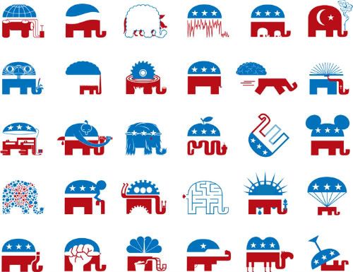
The Chicken Logo, and a Few More Potential Logos to Replace the Elephant


Recently, I created a chicken logo for Nevada candidate for Senate (and Harry Reid nemesis) Sue Lowden. She's the goofy lady who thinks the answer to health care is to pay cash, or barter such items as chickens or manual labor at the doctor's office.  After making the logo, it occurred to me (I'm a sign maker and logo designer) that the GOP has lots of options if they want to try something besides their old elephant.  After all, their base has now accepted "tea partier" rather than Republican as their political identity.  And what the hell is with those upside-down stars, anyway?


Wednesday, March 17, 2010

Logorama: Best Animated Short Oscar

I'm a graphic artist--which may not be in high evidence on this here blog--so I really dug this cute little movie. Logos come to life! I love it!

Friday, December 11, 2009

America Online Rebranded as "Aol."


The last several days, AOL has been asking me to try out their new "welcome screen" every time I sign on. Waitaminute. . .I still use America Online? Yes, yes I do. For a liberal, I can be strangely attracted to sameness, and while I don't fear change, I am initially resistant to it. And I've developed work and play habits on the computer that are comfortable. So, AOL stays.

It turns out that a lot of people haven't stayed however, and AOL needs to spruce the joint up to try and attract and keep users. So I guess it's out with the triangle/circle logo. Which makes sense, since it grew out of the ollld "A" logo that had sort of an "OL" inside it. It looks like now, the new branding is "Aol period." Which is a little weird. Actually, the very name AOL has always been weird. Shouldn't have been "AO?" And now the "ol" part is lower-cased and punctuated. And used on a variety of backgrounds, it looks like.

Anyway, I always find rebranding efforts interesting. Not sure if this is a win or not, but it does show that AOL has some sort of interest in staying relevant and interesting. Who knew?

[Excerpt]

AOL Unveils New Brand, New Logos

AOL unveiled a "new brand identity" Sunday night. Instead of AOL, it's "Aol." -- period included. There are also six new logos -- from a goldfish to a paint swirl. A spokesperson says more are coming. . . (
Click through to see the logos)

Read more at: The Business Insider

Tuesday, June 30, 2009

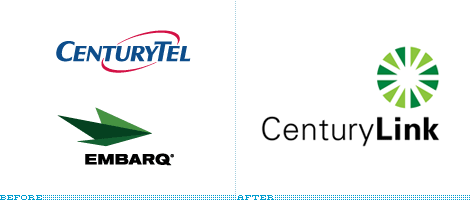
Embarq Becomes CenturyLink


Image from source, Brand New

A couple of years ago, our local phone service went from Sprint to Embarq. I thought Embarq was an interesting name, and I have to admit I really liked the logo. It was sort of a paper airplane design, and I was fortunate enough to have the right color foils in my library at work to depict it without resorting to four-color process printing (which usually produce unacceptable dot patterns on my sign company's equipment).

But now, apparently, Embarq is becoming something new--already. It's changing to CenturyLink. I've got to say, I'm not a fan of either the logo or the name. And I'm only featuring it on the blog because I love the site BrandNew, and because I'm a big fan (and professional designer of) logos. And hey, at least they got rid of the swooshes. See what you think.

[Excerpt]

Visualizing the Link

Still waiting for federal regulatory approval on the transaction of the merger between CenturyTel and Embarq — two telecommunication companies that, together, will bring together more than two million broadband customers (you can learn more about what they each do here) — the combined entity has announced their new name, CenturyLink.

Read more at: Brand New

Wednesday, May 6, 2009

The Evolution of the GOPosaur


Image from source, DailyKOS

As a graphic artist, I was impressed (and more than a little jealous) at the creation of this new emblem for the Republican Party.

[Excerpt]

The Goposaur

Republicans have been hilariously trying to give Democrats branding suggestions as of late, as if their problem has been a lack of fresh new insults. Well, why we haven't had much of a shortage of insults of late (all we have to do is point at the latest Republican hilarity), that still doesn't mean we can't offer our own branding advice. . .

Read more at: DailyKOS

And then there is this, from their comments section. Brilliant. Still jealous. . .


Thursday, April 23, 2009

Most Inappropriate Logo of All Time


I'm a sign maker by trade, and a logo maker by specialty. So this hits not only my (12-year-old) funny bone, it also hits my designer bone (heh, I said bone). Anyway, you've got to admit this is pretty funny.

The most inappropriate logo of all-time

In the 70s, this picture stood for God's children. Now it just stands for boys giving priests a good ol beej. Yes, this is an actual logo designed in 1973 for the Catholic Church’s Archdiocesan Youth Commission. It even won an award from the Art Directors Club of Los Angeles.


Tuesday, March 3, 2009

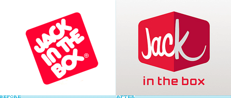
Subliminal Image in New Jack In The Box Logo?


I've found quite a few web sites out there where I can get lost for hours; Wikipedia, IMDB, I Can Has Cheezburger?, Engrish and FailBlog are just a few. But as a graphic artist who specializes in logo design, I find Brand New (a division of Under Consideration) particularly interesting.

A while back, I linked to them because of a story about Pepsi-Cola's dreadful new "butt-crack" logo design. Since then, I've been checking in every so often to see what brand has gotten a redesign.

One of the new ones is for Jack in the Box, the west coast regional hamburger chain. Their old logo was very dated, but also kind of cool. The way the letter forms fit together was quite creative, even though the "OX" part looked sort of like a Jesus fish. In fact, I've nicknamed it Jack in the Bejesus because of it. I'm mixed on the new logo. It isn't bad. It isn't great. It's OK. But--as a commenter noted in the replies to the excerpted article--is that a breast subliminally outlined in the extended "K?" Sure looks like it to me!

[Excerpt]

Just Jack

I don't travel much to the West Coast, so my only face-to-face experience with the fast food chain of Jack in the Box is limited to one tasty burger back in the late 1990s and I remember it was quite satisfying. . .

Read more at: Brand New

One thing that Jack in the Box hasn't changed is their consistently funny ad campaign, featuring the big-headed clown in a suit. It's been running for 15 years, and though they literally threw Jack under the bus for the Super Bowl ad, they're still going. Check it out.


Tuesday, February 3, 2009

How's that Whole Pepsi Re-Branding Going?


A while back, I ran a post about Pepsi-Cola's new logo designs, and my dislike for it. As I pointed out back then--and I found out that it wasn't an entirely original observation--Pepsi's new logo kind of looks like a refrigerator repair man's muffin top.

I've been a Pepsi fan for a long time, though I like Coca-Cola's products too. Over the years, I've had many different Pepsi items, with lots of different logos. Almost all of those logos featured some variation of the famous "yin-yang" Pepsi ball. With the new logo, the old ball is gone, replaced with a very strange looking "smile" ball, with various sizes of grin depending upon the version of Pepsi you're drinking.

I've already given my reasons for disliking the logo. I've even already linked to the page excerpted below, with other peoples' opinions. But since then, there has been a bubbling over (heh) of opinion, most of it overwhelmingly negative. Also included are negative reactions of the new Sierra Mist, and the Mountain Mtn Dew. And they don't much like the new bottle shape, either.

[Excerpts]


"I'm sorry, Pepsi, but I hate your new logo and label design. . .the "Clean" look is "in" right now, but so were bell bottoms, followed by tapered jeans, then it was super baggy. Don't just become "another clean designed brand". Do something new and exciting. These logos are awful."


"Ughh. I kinda like the font, but the Pepsi logo drives me crazy! the white bands are drawn awkwardly- slightly wonky- It looks like first year design student work. The bottle design looks like the gut of a person that drinks their product. ick."

"This looks like bad student mock-ups, and I wouldn't hire the kid."

"I'm sitting here for some god forsaken reason, reading everyone's rants on the logo change...and for the life of me I don't see the f**king smile...really...who smiles like that anyway? And yes, the bottle definately = wrinkly penis!"

"Haha. Nice joke PepsiCO. Now get back to the old design."

Couldn't have said it better myself.

Read (much) more at: BrandNew


Tuesday, May 20, 2008

Stuck on Stupid: Religious Zealots Boycott Starbucks


Photo from source, Star Tribune

I want to comment, but. . .I have no words for this.

[Excerpt]

Group finds Starbucks logo too hot to handle
Seems that one person's smut is another person's morning latte.

A Christian group based in San Diego found grounds for outrage over the new retro-style logo for Starbucks Coffee. . .

Read more at: Star Tribune

Thursday, May 1, 2008

I've Had Enough: No More Logos With Swooshes!


Image from source, Logo Hell

Though the appearance of this blog may belie the fact at times, I am a graphic artist. And as a graphic artist, I have tired--to say the least--of logos with swooshes. It seems that if a company has existed for years, be it Dairy Queen or Triple-A, they "spruce it up" with swooshes.

It's tired, and it's over-used. They're as ubiquitous as Trajan Bold as a font. They're worse than droopy pants (a trend that won't die). Just stop it! There are other choices available! Rant over.

[Excerpt]

Do you need a cool new logo? Is your old logo lacking coolness? Well, why not join millions of other companies by adding a design element that screams cutting edge. That shouts future. That bellows progress. . .

Read more at: Logo Hell
Related Posts Plugin for WordPress, Blogger...