Showing posts with label Photoshop Fun. Show all posts

Saturday, October 27, 2012

What Happens In Vegas: Romney Photoshops Henderson Crowd


Oh, my word. I understand why politicians might want to inflate their momentum. You know, make it seem like there is more wind in their sails than there really is. Sometimes these things are more about perception than reality. For instance, in the first debate, President Obama did badly. But the legend grew that Mitt Romney did fantastically, unbelievably, amazingly WELL!!! Not true. The whole affair was a stultifying, sleep-inducing, unenjoyable slog. But the legend will live on, regardless of what happens on November 6.

Mitt Romney's Henderson rally. If the lower image
looks a little odd, your eyes are not deceiving you.
Image from source, The National Memo.

But if your campaign is going to fudge the facts. . .tart up history in a frilly frock if you will. . .do it right! This attempt at crowd inflation is a sad, sorry affair. It should never have been allowed to see the light of day. Then again, the Romney campaign has seen fit to ignore fact checkers, and continue campaigning with known, provable falsehoods, so why not?  If Toto pulled back the curtain, and Romney was really Professor Marvel, they'd move along as though it never happened. And their supporters hate the President enough to go along with it.

See the key to the Photoshop Fun at: The National Memo


Wednesday, March 9, 2011

Anything but Politics: Photoshop Disasters

This is just hilarious. I didn't notice at first either. Look at the lower skirt area. That just. . .can't. . .happen.


Friday, October 1, 2010

Mac Update: My Struggles with "Switching" Continue (Take 3)

I've never had this happen before. I've written essentially the same post twice before, and both times had all of it simply vanish.  The post itself may not even be worth the effort, but having narrowed down the problem (a website that apparently doesn't want their images used, attributed or not), I'm going to give it a shot anyhow.

In my ongoing effort to teach myself the Mac OS X Leopard operating system and Adobe CS3 graphics suite, I've tried to teach myself something new every week by creating something.  So, when I needed some street signs for a blog post, I forced myself to sit at my Mac rather than my PC. Using CorelDRAW X3 on my PC, I could complete the job in just a few minutes.  All I needed was two rectangles with radiused corners, some white text, and a nice faux green reflective background. Throw in a soft drop shadow, and voila! Child's play.

Image from Corel.com.
Note the absense of clutter.
I found the project much more vexing with Adobe Illustrator on the Mac platform.  My one-off job took me an hour and a half as opposed to 5-10 minutes.  Part of the problem is just the clutter and distraction offered with the Adobe suite. I've loathed Adobe products since the old days of PageMaker. I don't like the way anything is displayed, I don't like how "import" is called "place," and I especially don't like the 1,000 palettes covering up what I'm working on. Add this to the Mac showing any open programs through all of the little gaps between palettes, and it all hits me like gibberish.

I couldn't figure much of anything out without the Help menu (which turns out to be pretty awesome).  I find this learning curve to be much steeper than the one I faced 13 years ago, when I had to apply my Corel knowledge to the Gerber Omega/Graphix Advantage Composer sign software.  The sign industry grew up on the PC platform, and I was lucky to have started there too with VP Graphics, and then CorelDRAW 2.  While clunky at first, Composer grew to adopt many similar characteristics of Corel's software.  But with Adobe, I'm a lot more adrift.  The knowledge transfers, but the learning experience is frustrating.

A screenshot of Illustrator on my Mac
But I had an epiphany while trying to write this (three times).  Since Corel allows you to set up CorelDRAW and Photo-Paint to look nearly identical to Adobe Illustrator and PhotoShop, my next lesson is going to be on the PC, but with this feature turned on.  It would be nice if Adobe offered a similar feature, but maybe I'll have an easier time of things if I'm in a familiar program while navigating unfamiliar tools. We'll see.  Meanwhile, my home schooling project is turning out to be a lot more frustrating, and a great deal less fun than I'd hoped.

Sunday, August 1, 2010

Fun With PhotoShop: Whitney Houston

I don't know why the tabloid is focusing on Whitney Houston's eating binge. I'm much more concerned about her third hand.

Source: PhotoShop Disasters

Monday, May 24, 2010

Frivolity Break: Madonna's Secret Age Cream!

While I watch the--so far fabulous--final episode of Lost, here's a funny little item I found while trying to avoid spoilers. Via Queerty.


Friday, March 12, 2010

20 Worst PhotoShop Mistakes


Image from source, Grievous Bodily Charm

I got this via email from my Mom, and couldn't resist sharing it on the blog. Yes, I've seen a couple of them before, but PhotoShop disasters are a favorite subject of mine, being that I'm a graphic artist. Of course, not all of these are necessarily PhotoShop errors (in fact, there are other photo editing programs out there. . .I use Corel). A couple may just be very odd photographs, like the female model with a seemingly male "part." But all are fun. Except for the keyboard one, which I haven't figured out yet.

[Excerpt]

20 Worst Photoshop Mistakes

When used correctly Photoshop has the ability to make people appear thinner and more beautiful, as well as the power to give millions an inferiority complex. It seems every image in every magazine has been Photoshopped these days, and this has lead to what must be amateurs being let loose on images that are going to print. Below are some of the most ridiculous and obvious Photoshop disasters which have slipped through the net and being printed in magazines or on posters. . .

See them all at: Grievous Bodily Charm


Thursday, October 15, 2009

Featured Site: PhotoShop Disasters


Given the recent splash made by Ralph Lauren, their terrible PhotoShopping of models, and the letigiousness that followed, it was kind of surprising to see another hideous 'shopped pic from the same fashion house. As an artist (and a human) I'm simply baffled how anyone could have thought this looked good (or human).

Ordinarily, I wouldn't be too sympathetic to those who say, "won't someone please think of the children?" In this case, I sort of have to agree with that sentiment. Think about all those anorexia after school-type specials, where no matter how skinny the girl gets, she still thinks she's fat. Well a girl like that looking at this shot? Thinking she could diet her way to a pelvis that small? Yikes. And a tip to girls like that: no guy is looking at you, wishing you had a tiny, tiny pelvis.

Oh, and I should mention that the site this comes from is a ton of fun. It isn't just fashion houses that tragically alter their models. And usually, it isn't with the plan to make them look impossibly skinny either. Have a look.


Monday, September 7, 2009

Political Satire Done Right: Glenn Beck as The Joker


I wrote a post recently questioning the right wing's ability to be funny. At issue is a now ubiquitous photo-shopping of President Barack Obama as The Joker. Usually, this piece of political "humor" is accompanied by the word "socialist." Where, I asked then (and now) is the humor? What's the joke? Aside from the vaguely creepy reverse-black face, what were they going for?

It didn't seem to matter to the tea baggers and town hall angry mobs. They took to the image, and it has popped up all over the place. Now, someone has seen fit to 'shop an image of Glenn Beck in a similar fashion. Now this is humor people! The Joker is batshit crazy, and so is Glenn Beck. No need to explain the joke, it sells itself. Take notes, aspiring right-wing humorists.

Source: LTR

Wednesday, August 19, 2009

Arizona GOP Uses "Doctored" Photo of Obama

Remember when CBS ran with a story about George W. Bush shirking his National Guard duty, and the documents were then questioned? Though the documents weren't conclusively proven to be phony, they were perceived to be so. Arguments by many that whether or not the documents were genuine, the story was true were met with--and are still met with--derision by the right wing.

Much the same in reverse is happening with a "doctored" photo of President Obama smoking. Sure, he's admitted to smoking off and on. But the photo the Arizona GOP has used to show this is a phony! Will that shut them up? Dream on.

Tuesday, August 18, 2009

Obama "Joker" Artist Revealed


Image from source, LA Times

I've written a couple of posts about conservative humor, and their appropriation of a (formerly) anonymous artist's rendition of President Obama as the Heath Ledger version of Batman nemesis, The Joker. Usually, the image is shown without the Time magazine cover, and coupled with the word "SOCIALISM."

I've criticized the work as creepy, though well done. I didn't label it racist, though for some reason it does lend itself to that description, perhaps because of the reverse-black face, anti-Al Jolson imagery. Most of all, my problem with it was that I don't get the joke. I love humor, political humor especially, even if it is directed at my own ideology. But the key is, it's got to be funny. I posted a link last week to a treasure-trove of conservative digital "humor," which included variations of the "Obama Joker," and the key element linking them was that they weren't particularly funny. Some were very clever artistically, but where's the joke?

I'll give you an example. I got an email at work that was a picture of an unknown person in some sort of tribal dress. Obama's head was superimposed on the body, with a bone through his nose. The caption was "ObamaCare," and I get the joke--as distasteful as it is--that Obama is some sort of witch doctor. Stupid, yes, but there is a joke there. But it is muddied by the fact that the "C" in ObamaCare is a hammer and sickle. He's a communist witch doctor? Hunh? One step too far (at least).

Now we know who the artist of the Joker image is. With this revelation, charges of racism, or meanie conservatives are seemingly deflated. Except that the image has been co-opted in ways that certainly have a different agenda than the artist intended. Worst of all? Still not funny.

[Excerpt]

Obama Joker artist unmasked: A fellow Chicagoan

When cryptic posters portraying President Obama as the Joker from "Batman" began popping up around Los Angeles and other cities, the question many asked was, Who is behind the image?

Was it an ultra-conservative grassroots group or a disgruntled street artist going against the grain?

Nope, it turns out, just a 20-year-old college student from Chicago
. . .

Read more at: Los Angeles Times


Incidentally, the artist talks about a "Bush as Vampire" image by Spencer Fairey. I could be wrong about this, but the image I'm most familiar with with that theme was actually by Alex Ross, famed painter of DC super heroes. Fairey may have done one, but I can't find it. The Ross image, however, does contain (dark) humor, and works as political commentary. That's what seems to be missing lately.

Monday, June 29, 2009

Bad PhotoShop Job: FunGuide Racial Diversity


Image from source, National Post

"PhotoShopping" can be a hoot. I've done it for fun, used it for comic effect here on the blog, and use it in my work to superimpose signs onto buildings for customers. Most of what I've done (and I don't even use PhotoShop, I use Corel Photo-Paint) doesn't need to be 100% photo-realistic. But even my goofy attempts are more believable that the one featured in the excerpted article below. It pretty much jumps up and screams "PhotoShop Job!"

[Excerpt]

City digitally adds black guy to Fun Guide cover to make it more ‘inclusive’

The smiling, ethnically diverse family featured on the cover of Toronto's latest edition of its summer Fun Guide was digitally altered to make the photo more "inclusive," which city officials say is in keeping with a policy to reflect diversity. . .

Read more at: National Post

Thanks to Stupid Monkey Planet for the link.


Tuesday, May 12, 2009

President Barack Obama: Cool and Logical


Image from source, New York Times

President Obama as Mr. Spock? Had to post it. Had to.
Good photoshop job, though frankly it may have been easier to 'shop Tuvok from Star Trek: Voyager!

[Excerpt]

Put Aside Logic

I dreamed that Spock saved our planet, The Daily Planet of journalism.

Instead of swooping in to figure out the dimensionality and logarithms to rescue the world from red matter, as Spock does in J. J. Abrams’s dazzling new “Star Trek,” I imagined Spock rescuing read matter for the world. . .

Read more at: New York Times (via AmericaBlog)

Monday, May 4, 2009

Drudge Report Uses PhotoShopped Franken Picture


Using PhotoShopped images in news reports is generally frowned upon, unless the image is stated to be a fake, or it is so well known to be, that it is understood. FOX "News" has used edited pictures to make political opponents--meaning Democrats--look bad. Defenders of FOX then would point to Countdown with Keith Olbermann's use of obvious caricatured photos, to say "I know you are, but what am I?"

But there is one photo floating around the Internets for several years of Al Franken in an unflattering--to say the least--pose. And it is rarely if ever pointed out that the photo is a fake. The photo is bizarre, and has no satirical context that would make it funny. It's a shot of soon-to-be Senator Franken in an adult diaper, with rabbit ears on his head. This is further proof that conservatives have decidedly odd senses of humor. It also points to the dishonesty of several right-wing blog and "news" sources, like The Drudge Report.

The top image is a screen capture of today's Drudge. The bottom one is of a story item immediately below that, with the fake Franken image. This image relates in no way to the linked story, and nowhere on Drudge does it indicate that the image is a fake. When you take into account that the average reader of Free Republic believes the image to be real, you can see why this is inherently dishonest. I'm thinking somebody out there needs to 'shop an image of Drudge and widely circulate it. Hmmm, now who do I know that could do that?


If you'd like to see the debunking of the image, go to: ThinkProgress


Saturday, February 28, 2009

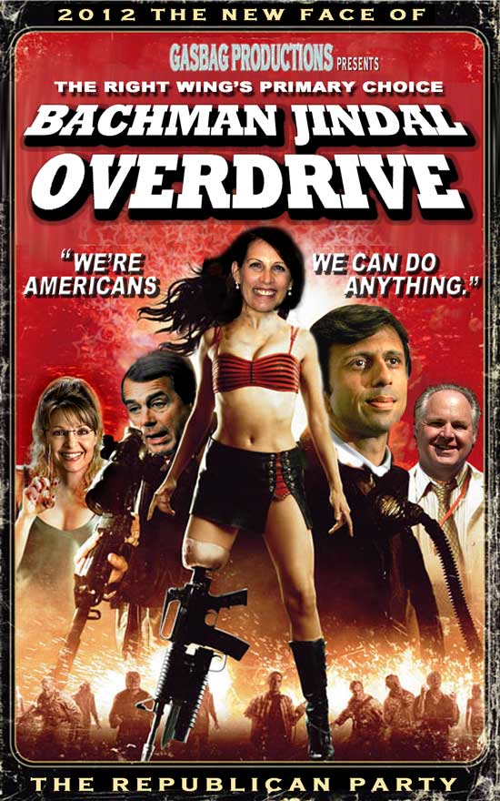
Picture of the Day: The New Face of the Republican Party


I found this at The Stephanie Miller Show's "Photoshop Fun" section of their web page, and thought it went so well with my previous post (Today's GOP: A Cast of Cartoon Characters), that it needed to be here.
(Click to embiggen)


Wednesday, December 3, 2008

FOX "News" or Think Progress Responsible for Doctored Photo?

I posted a piece linked to Think Progress a few posts ago, regarding a photoshop job on The O'Reilly Factor. Shortly after that, at Johnny Dollar's Place, a "FOX Fan" site, Johnny claimed that it was Think Progress itself who was guilty of photo manipulation.

What is the real story? Hard to say. I dabbled in video editing way back before it was mainstream, so I don't know. Could different screen grabs from different equipment make both screen grabs genuine? Maybe. To me, it looks like the one on JDP is still manipulated, stretched vertically, washed out. The one from TP looks even more stretched, and darker. Deliberate trickery? By either, both or neither? Hell if I know.

So here are the images, I report you decide. Heh.

Think Progress's screen grab vs. real image of Jeff Zucker:


Think Progress' screen grab:


Johnny Dollar's screen grab:

Tuesday, December 2, 2008

They Did it Again: FOX "News" Alters Photograph


UPDATE: This story has been disputed. I have a new post up on the subject here.

Altered FOX "News" image from source, Think Progress

Some time ago, Fox & Friends, the oddly-named morning show on FOX "News" did a story where they used altered photographs of reporters that dared to criticize them. They didn't let on that the photos were altered, which seemed a bit unprofessional. Not to mention potentially anti-Semitic, as many thought that one photo was altered in a stereotypical way. This was all parodied to great effect in Vanity Fair.

Well, this time FOX's star is in on the action. The O'Reilly Factor featured an altered photo of favorite whipping boy, Jeffery Zucker, NBC President. And before Johnny Dollar stops by to say, "MSNBC does that on Countdown with Keith Olbermann!!!" Yes they do, but in an obvious, satirical way. No one would mistake KO's photo caricatures for real pictures.

[Excerpt]


Last July, Fox and Friends aired doctored photos of New York Times reporter Jacques Steinberg and editor Steven Reddicliffe while attacking them for writing stories critical of Fox News. As Media Matters noted, “the journalists’ teeth had been yellowed, their facial features exaggerated, and portions of Reddicliffe’s hair moved further back on his head.” Some saw the photos as anti-Semitic. . .

Read more at: Think Progress

Thursday, October 9, 2008

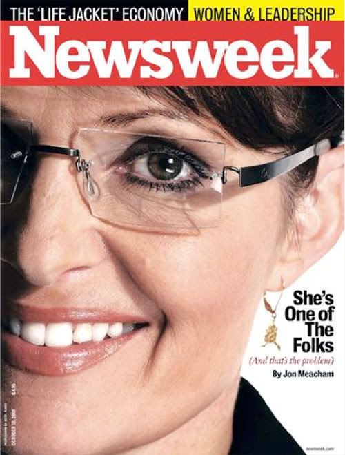
Shocking News: Newsweek Did NOT Retouch Palin


Image from source, DailyKos

Wait a minute, what? Conservatives (and naturally, FOX "News") are upset that Newsweek magazine put Sarah Palin on its cover, and did not retouch her? I totally don't get what the fuss is about. She's got a little creping about the eyes, and that's really all I see. All in all, she looks good for a 44-year-old woman, if you're into that kind of thing.

But apparently, this is the height of sexism, and liberal hate. Or something.

[Excerpt]

Fox and GOP wingnuts furious at Newsweek over Palin cover pic

At first I thought you gotta be shittin me, but it's true.

Financial meltdown? Nah. People losing their mortages? Yesterday's news. Healthcare premiums going thru the roof? Not our problem.

But Newsweek dared feature a cover that highlights every imperfection--their words not mine--in their cover of the Alaskan wolf shooter. . .


Read more at: DailyKos

And here is the FOX "News" hysterical take on the subject. The host is particularly disgusted:

Friday, September 5, 2008

Republicans Settle on a Message

The most curious thing about the Republican National Convention (besides the horrifically out of step "dancing" and synchronized hat waving by the mostly white crowd) was the overly enthusiastic response to John McCain--a man many Republicans did not want to get the nomination--and Sarah Palin, a woman they'd just met a few days ago.

This photo might go a ways to explaining just how they fell in line.


Source: DriftGlass

P.S. Yes, I know it's a photoshop job. I don't care, it's funny!

Saturday, July 12, 2008

Iranian Missile Test Not All it Seemed?


Photo from source, Raw Story

I haven't yet commented on the Iranian missile test earlier this week, because something felt odd about it. It seemed like a show of bravado, but maybe not one worth worrying about. Predictably, right-wing world went nuts, somehow conflating non-nuclear weapons with nuclear ones. And--for reasons I cannot fathom--right-wing world desperately wants to go to war with Iran. So this just fanned the flames.

Then, it turned out that Iranian media sources had PhotoShopped one of the tests to make it look more dire. And now, we're hearing that the test may have all been for show after all. Don't expect that to make a big splash on FOX "News."

[Excerpt]

Iran missiles were 'old equipment ' but tensions remain high

Iran's missile tests earlier this week didn't demonstrate any new capabilities and may not have included the long-range missile Iran claims among those launched, a US official said. . .

Read more at: Raw Story

Friday, July 11, 2008

The PhotoShop Effect: Model Perfection

Sometimes, when I'm on a quest to find something to blog--and coming up short on ideas--I happen upon something interesting I might not of found before. That is the case here. A website called Diet.com sent out a fit, pretty girl for a photo shoot, and then demonstrate what sort of retouching a professional would do before putting her on a magazine cover.

I'm a graphic artist, and have done a limited amount of photo retouching. It's fun, I'll admit. But I'm not sure I like the idea of our entire photographic history of people being faked nearly all the time. I mean, it makes sense on movie posters, advertising, and magazine covers (though they sometimes go ridiculously overboard). But if this photo artist is to be believed, "99.9%" of magazine photos are retouched in this way. Well, unless you read the tabloids.

Related Posts Plugin for WordPress, Blogger...