Showing posts with label Fun with photoshop. Show all posts
Wednesday, February 3, 2016
Friday, June 21, 2013
Another Paula Deen Scandal, Y'All!
![]() |
| I'm 40, y'all! Image from First For Women. |
I'm kidding, this was just something I noticed at the grocery store today. While at the checkout, I was amused to see that Paula Deen is on the cover of First for Women magazine. The timing of that is probably a headache for the magazine, you know having a racism scandal probably doesn't help sales.
But what really gets me is the heavy amount of Photoshop used on Mrs. Dean's photo! I mean, I know they digitally sculpt the crap out of supermodels and megastars, but Paula Deen? This is a 66-year-old, plus-sized woman. Everybody knows that. But just look at that photo. Then take a look at one of the videos from Deen's apology tour. Doesn't this qualify as a scandal too?
Posted at
Friday, June 21, 2013
by
James Greenlee
Labels:
Fun with photoshop,
Paula Deen,
Photoshop,
Racism,
Scandal
Thursday, October 11, 2012
New Paul Ryan Workout Shots Get Animated!
Posted at
Thursday, October 11, 2012
by
James Greenlee
Friday, September 21, 2012
In Case You Missed It: National Review Alters Obama Photo "Abortion" Signs
![]() |
| Yeah, their signs didn't really say, "ABORTION." Image from source, JimRomensko.com. |
That alternate version is far more literal when it is presented as the real version, as it was in this National Review cover.
[Excerpt]
National Review: By the way, our Obama cover was altered
Todd Sumlin writes: “I am a photographer at The Charlotte Observer. I was on the photo platform directly behind the President at the Democratic National Convention. Attached is a photo from that same angle. As you can see, the posters the North Carolina delegates are holding were changed from ‘Forward’ to ‘Abortion.’. . .”
Read more at: JimRomensko.com
Wednesday, February 1, 2012
Amaze Balls: Inserting 3D Objects Into Existing Photographs
Thanks to my good friend and contributor, Stupid Monkey Planet for sending me this video. It goes to show you, there is no "proof" that is good enough anymore, depending upon your budget and computer talent. It will make conspiracy theorists impossible to reason with.
Saturday, January 7, 2012
Mac Vs. PC, The Experiment Continues
Okay, so I've had my "new" MacBook Pro for a few weeks, and I thought it was time for a status update.
A little background first. I've been a PC user/guru for nearly as long as they've been used in the mainstream. It really wasn't until the late 1980s/early 90s--when Microsoft Windows 3.0/3.1 really took hold--that the average American began to become familiar with them. That's when I started to use them for work and that is when I started taking to them like a fish to water. We're talking the days before hard drives, and booting from DOS. Anyway, as Windows grew, and megabytes turned to gigabytes, megahertz to gigahertz, floppy drives to hard drives to optical drives to flash drives to the cloud, I've been a PC.
In my career as a graphic artist, I've been a PC. Haughty Mac users have for years looked down their noses at me, since you "can't do" graphics on a PC. This is hogwash of course. And as a graphic artist in the sign industry (much as in the embroidery world), the PC has always been the platform of choice. CorelDRAW grew up with the PC, as did proprietary sign-making software. I have had no problem doing anything on the PC that a Mac user can do. In fact--in my experience--Mac artist often (very often)--cheat in their drawings, using special effects, extra shapes, masks and other tools to make their drawing look good on the screen or on printed paper, but useless for making a real-world product.
So, as you can tell, I've had a bit of resistance to accepting the Mac in my PC world. But more and more, I'm finding that I need to use Adobe Illustrator to manipulate other people's graphics. Some drawings in AI (an almost default file format) simply do not translate well when moved into other programs (again, all of those cheats and special effects). My working knowledge of AI is very basic. With my mastery of CorelDRAW and sign software, using AI is painful. It is much less user-friendly, and many of its features seem difficult (backward, in some cases) compared to my second-nature shortcuts and mouse clicks in the other programs. Adobe PhotoShop is even worse in that regard, when Corel Photo-Paint is easy.
But you know what? If I ever need to know AI or PS (or even the rest of the Adobe Creative Suite), I'd be set adrift in an unfamiliar world, despite my 20+ years of computer graphics experience. So, a couple of years ago, I decided I'd better learn, if for no other reason than I'd be able to bring something to my current job, and increase my knowledge for a future one, should I ever need it. I decided that I should buy a used computer with the software pre-loaded, in order to save costs (the Adobe suite costs over $1,000, not counting the computer). And I also decided, it should be an Apple Macintosh computer, since the goal is learning, and because I had no familiarity with it.
After chatting with a friend on Facebook, I found a used PowerMac laptop for $300 with a pre-loaded CS3 suite. Initially, this worked out great. I was able to learn a little of how the Mac OS X operating system worked. I was able to get (somewhat) comfortable with where everything is, and how to do it. I even tried a few lessons with the Adobe Suite. But the machine was infernally slow. It was (to be fair) at the time a four-year-old computer. But, even with my addition of a 1 GB memory stick (bringing it to 2 GB), it was nigh useless for any serious project. Unless I wanted to drive myself mad.
Travis--a teenaged son of a friend and Cult of Mac adherent--reasoned that I couldn't judge a Mac based on an "old" computer. This may be true, but a four-year-old top of the line computer ought to keep up with an even older bottom-of-the-barrel PC. It sure as hell ought to be able to surf the internet without bogging down, and displaying the "spinning beach ball of death" every 10 seconds. Shouldn't it?
Eventually, I had to just throw in the towel, and admit that my old Mac wasn't going to cut it. I never did get comfortable with CS3, because I couldn't stand the frustration. So, I sold the old Mac on eBay (buyer beware!), and bought a newer old Mac. This time, it was a Macbook Pro, with a Core2Duo processor and 4 GB of RAM. I ended up winning an eBay sale, nearly panicking when I did so, not sure I got the right thing. Upon receipt though, I found that I could scarcely have done better. I got the last Mac model (early 2008) before they started making them out of a single piece of aluminum (unibody). It's the top-of-the-line, but "old" enough not to be too expensive. It's as old as the PowerBook was when I got it, but newer than this here blog is.
As I was hoping, this Mac is not only better, it's awesome! If I had gotten this one the first time, by now I might be a Mac/Adobe aficionado! Though I haven't yet completed a project in CS5 (yes, it came with the NEW suite!), I fully intend to. I'm armed with a stack of OS X Lion and CS5 books from the library. And this time, it isn't going to be torture. The new computer is quite zippy, the memory-hog programs open in seconds. The computer will even reboot in less time than any computer I've ever owned. To date, the "spinning beach ball of death" has only ever spun for a second or two, where it was a continual presence on the PowerBook.
As far as my PC vs. Mac feelings go, I can't say I'm a Cult of Mac convert yet. It isn't better, it's just different. I have a brand new quad-core Dell PC as my desktop setup, and it's is faster, though not by much. I'm still much more familiar in a PC environment, and can "get under the hood" much faster, and with much more assurance. But my MacBook will continue to be my casual use go-to, since it is portable. It will go with me on trips. And I'm no longer soured by the nearly useless experience with the PowerBook. I only worry that this Mac will grind itself to uselessness as it ages. PCs can be re-souped up even in older age to at least be used as internet terminals. I hope this Mac can do the same.
I'll be posting the results of my first Mac graphics experiment (the first successful one, anyway!) once I have it done, hopefully this weekend. If you are a PC who is bi-curious (in the computer world, silly), I can recommend staying away from Motorola-based older Macs, but Intel Core2Duos or above? Go for it! But weigh the pre-loaded software models heavier. As expensive as these suckers are, you'll be discouraged otherwise.
![]() |
| This is a PowerBook and the early Macbook Pro side-by-side. They look very much alike, only with different ports, and an iSight camera on the Macbook. |
In my career as a graphic artist, I've been a PC. Haughty Mac users have for years looked down their noses at me, since you "can't do" graphics on a PC. This is hogwash of course. And as a graphic artist in the sign industry (much as in the embroidery world), the PC has always been the platform of choice. CorelDRAW grew up with the PC, as did proprietary sign-making software. I have had no problem doing anything on the PC that a Mac user can do. In fact--in my experience--Mac artist often (very often)--cheat in their drawings, using special effects, extra shapes, masks and other tools to make their drawing look good on the screen or on printed paper, but useless for making a real-world product.
![]() |
| The Adobe CS5 Suite. Pricy. |
But you know what? If I ever need to know AI or PS (or even the rest of the Adobe Creative Suite), I'd be set adrift in an unfamiliar world, despite my 20+ years of computer graphics experience. So, a couple of years ago, I decided I'd better learn, if for no other reason than I'd be able to bring something to my current job, and increase my knowledge for a future one, should I ever need it. I decided that I should buy a used computer with the software pre-loaded, in order to save costs (the Adobe suite costs over $1,000, not counting the computer). And I also decided, it should be an Apple Macintosh computer, since the goal is learning, and because I had no familiarity with it.
![]() |
| The "spinning beach ball of death" A common problem with my PowerBook. As bad as the Windows hourglass or blue circle. |
Travis--a teenaged son of a friend and Cult of Mac adherent--reasoned that I couldn't judge a Mac based on an "old" computer. This may be true, but a four-year-old top of the line computer ought to keep up with an even older bottom-of-the-barrel PC. It sure as hell ought to be able to surf the internet without bogging down, and displaying the "spinning beach ball of death" every 10 seconds. Shouldn't it?
Eventually, I had to just throw in the towel, and admit that my old Mac wasn't going to cut it. I never did get comfortable with CS3, because I couldn't stand the frustration. So, I sold the old Mac on eBay (buyer beware!), and bought a newer old Mac. This time, it was a Macbook Pro, with a Core2Duo processor and 4 GB of RAM. I ended up winning an eBay sale, nearly panicking when I did so, not sure I got the right thing. Upon receipt though, I found that I could scarcely have done better. I got the last Mac model (early 2008) before they started making them out of a single piece of aluminum (unibody). It's the top-of-the-line, but "old" enough not to be too expensive. It's as old as the PowerBook was when I got it, but newer than this here blog is.
As I was hoping, this Mac is not only better, it's awesome! If I had gotten this one the first time, by now I might be a Mac/Adobe aficionado! Though I haven't yet completed a project in CS5 (yes, it came with the NEW suite!), I fully intend to. I'm armed with a stack of OS X Lion and CS5 books from the library. And this time, it isn't going to be torture. The new computer is quite zippy, the memory-hog programs open in seconds. The computer will even reboot in less time than any computer I've ever owned. To date, the "spinning beach ball of death" has only ever spun for a second or two, where it was a continual presence on the PowerBook.
![]() |
| So, maybe I'm a little nerdy and smart like John Hodgeman, and a little cool and savvy like Justin Long? |
I'll be posting the results of my first Mac graphics experiment (the first successful one, anyway!) once I have it done, hopefully this weekend. If you are a PC who is bi-curious (in the computer world, silly), I can recommend staying away from Motorola-based older Macs, but Intel Core2Duos or above? Go for it! But weigh the pre-loaded software models heavier. As expensive as these suckers are, you'll be discouraged otherwise.
Posted at
Saturday, January 07, 2012
by
James Greenlee
Tuesday, August 16, 2011
Featured Blog: Bachmann-Eyezed!
![]() | |
| One (and the only deserving one) of many people with Michele Bachmann's eyes. |
Bachman-eyezed
Again, found at the (obviously brilliant) Joe.My.God.
Monday, August 15, 2011
Newsweek Addresses Bachmann Cover Flap
Posted at
Monday, August 15, 2011
by
James Greenlee
Tuesday, May 10, 2011
Hassidic Newspaper Photoshops Hillary Clinton Out of Iconic Photograph
| The 'shopped image |
[Excerpt]
Hasidic Newspaper Issues Statement On Photoshopping Of Iconic Image
| The original image. |
Read more at: Failed Messiah
Thanks to Stupid Monkey Planet for the link.
Wednesday, May 4, 2011
Debunking the Birthers: Scanning a Certificate, Birth or Otherwise
As I've said here in the past, I'm sympathetic to conspiracy theorists, because I was briefly taken in by one: the 9/11 truthers. I exited out the other side with some swiftness, when things got a little too crazy to process. I still have problems with the "official" story, but have far more with most truther theories. It became clear to me that any contrary information to the truther story would be explained away, or somehow folded into the storyline. There is nothing that will dissuade them.
Such it is with the birthers. When Barack Obama released a scan--repeat: a scan--of an authenticated "long form" birth certificate from the State of Hawaii, the birther brigade went into high gear. Starting with one of their biggest flaws in understanding--that an internet-ready file is the document, rather than a scan of it--they went over the White House's PDF file with a fine-toothed comb. And within minutes, there was a new addition to the birther catalogue: The birth certificate has LAYERS!
Like any good conspiracy theory, there are a few nuggets that grab you. Hey, there are layers! I downloaded my own version, opened it in Adobe Illustrator, and--I'll be damned--the document was made of many incongruous layers. You could remove "clipping paths", ungroup it, and it was actually made of nine different parts! Why, this must be a forgery! FAKE! FAKE! FAKE! But wait a minute. . .
Why on earth would a forger do this? For what purpose would you separate out the background (but leave white holes where the letters were)? Why would you break up the word "BARACK" to "BA ACK" and a lonely "R"? You wouldn't, that's what. A forger would make a fake document, not a fake scan. The idiots. . .ahem. . .ignoramuses believing this theory don't think far enough out to realize that the document they are looking at is not an original, but merely a digitization of the original. If there are any fake elements of the document, they would not be discoverable in the PDF file.
But can I prove it? I believe I can. But I had to tread into semi-unfamiliar territory to do so. The only PDF scanning software I have is on my Mac PowerBook. And the only official document on safety paper I could locate easily is my Certificate of Marriage (my gay marriage, birthers!) from California. So, I set it up, scanned the document, and saved it. Here is what I found:
I scanned the entire document in high resolution into Adobe Acrobat Professional. I set everything to "automatic," and scanned it in. After saving the file, I opened Adobe Illustrator CS3, and opened my saved PDF. Immediately when it opened, I saw the document assemble itself!
After some right-clicking to "release clipping masks" and some ungrouping, I was left with four distinct layers. This is short of the nine from the Obama birth certificate, but I didn't even change any of the automatic settings. There are many options you can tweak. Also, my certificate has a very elaborate, different background and border, which may have affected my results.
But I think I've proven the point that yes, a scan of an official document does separate into layers when you scan it. They aren't predictable layers either. There were two very small bands of the border at the bottom of the image that separated themselves out for no particular reason. I didn't retouch, sharpen, blur, enhance or otherwise make any changes. The low resolution image at the right is merely a screen capture of my zoomed out screen, so that it can't be read (do you really need to know my business? No, you do not!).
Now, it should be noted that the most current birther theory about these scans is that there are duplicate letters in the document. Namely, they found two "E"s or two "1"s or two check boxes that look identical in different areas of the scan. Does that seem hinky? Maybe. Could I recreate it if I fiddled with enough settings, and ran enough tests? Maybe. Probably. Don't know, don't care.
I cannot with this test declare the Obama birth certificate to be genuine. But I can definitively declare that there is no obvious reason to believe that it is not, nor does the "layers" argument hold any water whatsoever. When some FReeper tells you that a scan cannot produce such a result, they are either lying, or they are wrong.
A NOTE TO MY READERS: If you venture into the comments section below, be warned that a troll who is too cowardly to leave his/her name has infested the blog. But he/she/it unwittingly proved a point. This troll is fixated upon the signature of Obama's mother, and how the software separated it into pieces. A similar thing happened to some of the lines and graphic elements in the document I scanned. So, while "Anonymous" is still focused like a psychotic laser beam on the signature!!!, I on the other hand am completely satisfied that the document offered online by the White House could indeed be produced by scanning a real document into a PDF software program. No hanky panky.
"Anonymous" has copious links to YouTube videos that "support" the forgery conspiracy theory, but don't fall for it. Anyone can produce and upload a YouTube video, as I found out with my new phone this weekend, when I almost accidentally uploaded an action shot of the floor of the house I was staying in. And if you get sucked in by the "facts" presented by these loons, please ask yourself what would motivate a forgery artist to use a low-res PDF scan to fool the public. The storyline hasn't even been articulated, because there is no scenario that would make any sense. And this is my final word on the subject. I think.
![]() |
| This is my reimaging of Obama's COLB. Have at it, Birthers! |
Like any good conspiracy theory, there are a few nuggets that grab you. Hey, there are layers! I downloaded my own version, opened it in Adobe Illustrator, and--I'll be damned--the document was made of many incongruous layers. You could remove "clipping paths", ungroup it, and it was actually made of nine different parts! Why, this must be a forgery! FAKE! FAKE! FAKE! But wait a minute. . .
Why on earth would a forger do this? For what purpose would you separate out the background (but leave white holes where the letters were)? Why would you break up the word "BARACK" to "BA ACK" and a lonely "R"? You wouldn't, that's what. A forger would make a fake document, not a fake scan. The idiots. . .ahem. . .ignoramuses believing this theory don't think far enough out to realize that the document they are looking at is not an original, but merely a digitization of the original. If there are any fake elements of the document, they would not be discoverable in the PDF file.
But can I prove it? I believe I can. But I had to tread into semi-unfamiliar territory to do so. The only PDF scanning software I have is on my Mac PowerBook. And the only official document on safety paper I could locate easily is my Certificate of Marriage (my gay marriage, birthers!) from California. So, I set it up, scanned the document, and saved it. Here is what I found:
![]() |
| This is a reduced image of the scan of the entire document. (I reduced the resolution so you vultures can't read it!) |
After some right-clicking to "release clipping masks" and some ungrouping, I was left with four distinct layers. This is short of the nine from the Obama birth certificate, but I didn't even change any of the automatic settings. There are many options you can tweak. Also, my certificate has a very elaborate, different background and border, which may have affected my results.
But I think I've proven the point that yes, a scan of an official document does separate into layers when you scan it. They aren't predictable layers either. There were two very small bands of the border at the bottom of the image that separated themselves out for no particular reason. I didn't retouch, sharpen, blur, enhance or otherwise make any changes. The low resolution image at the right is merely a screen capture of my zoomed out screen, so that it can't be read (do you really need to know my business? No, you do not!).
![]() |
| This is the full scan of the corner of the document. Then, I ungrouped it. . . |
Now, it should be noted that the most current birther theory about these scans is that there are duplicate letters in the document. Namely, they found two "E"s or two "1"s or two check boxes that look identical in different areas of the scan. Does that seem hinky? Maybe. Could I recreate it if I fiddled with enough settings, and ran enough tests? Maybe. Probably. Don't know, don't care.
![]() |
| Looky there! I can delete the foreground! But notice, some artifacts are left that are not part of the background image. |
The reason I don't care is that there would be no reason to make a forgery that way. I already explained that the forgery would be on the paper document and not the scan, which should be obvious. But if a digital scammer was going to fake the form, why on earth would he need to assemble his forgery from a bunch of tiny scanned elements? If that was all you had to work with, I'd get it. But it isn't. Barack Obama has the most awesome governmental apparatus in the entire world at his disposal. He could order up a document so perfect, so flawless, that its authenticity could bear the strongest of scrutiny. To assume that all they had to work with was low-res scans of little check boxes, and they had to duplicate them to complete their ruse is, in a word, stupid.
![]() |
| This is what happens when you delete the background. Look at all the random elements that were part of the background, but are on a layer with the text. Did I forge my marriage certificate? |
All of this ultimately leads to the conclusion that no matter what is offered up, or what points of logic are used, the birthers will never be satisfied. There will be a (smaller and smaller) group of them who will continue to believe that their conspiracy theory is true. And the same goes for the brand new "deathers" who are convinced that Osama Bin Laden is still alive, or was not killed this weekend. The release of authentic photos of the corpse would do nothing to change their minds. You'd just have 100 threads on FreeRepublic dissecting the photo. Excuse me, dissecting a low-res JPEG of the photo.
I cannot with this test declare the Obama birth certificate to be genuine. But I can definitively declare that there is no obvious reason to believe that it is not, nor does the "layers" argument hold any water whatsoever. When some FReeper tells you that a scan cannot produce such a result, they are either lying, or they are wrong.
A NOTE TO MY READERS: If you venture into the comments section below, be warned that a troll who is too cowardly to leave his/her name has infested the blog. But he/she/it unwittingly proved a point. This troll is fixated upon the signature of Obama's mother, and how the software separated it into pieces. A similar thing happened to some of the lines and graphic elements in the document I scanned. So, while "Anonymous" is still focused like a psychotic laser beam on the signature!!!, I on the other hand am completely satisfied that the document offered online by the White House could indeed be produced by scanning a real document into a PDF software program. No hanky panky.
"Anonymous" has copious links to YouTube videos that "support" the forgery conspiracy theory, but don't fall for it. Anyone can produce and upload a YouTube video, as I found out with my new phone this weekend, when I almost accidentally uploaded an action shot of the floor of the house I was staying in. And if you get sucked in by the "facts" presented by these loons, please ask yourself what would motivate a forgery artist to use a low-res PDF scan to fool the public. The storyline hasn't even been articulated, because there is no scenario that would make any sense. And this is my final word on the subject. I think.
Saturday, April 9, 2011
Fun With PhotoShop: Birthers 'Shop Obama Out of Grandparents' Picture
![]() |
| Well, clearly it's a fake. He's BLACK! They're WHITE! |
But more recently, birfers try to say that there is no evidence of Barack Obama's life. Bizarrely, they say there are no pictures of him as a youth, no evidence he went to the schools he says he did. Though the man wrote two autobiographical tomes, it is alleged that we know nothing about him. Odd. I remember a lot about a twenty-year affiliation with Reverend Wright. . .something about Bill Ayers. . .Right. Nobody knows him. Anyway, the storyline is like an LSD parade through the looking glass with Lewis Carroll and Grace Slick. Nothing is what it seems, and nothing can be believed, no matter how concrete or provable. Essentially, anything that fits the birther narrative is true, and anything that refutes it is delusion. Or something.
| The sunlight already looked fake. CLONING it makes it look faker. And the knee? |
Source: Joe.My.God.
Wednesday, March 9, 2011
Anything but Politics: Photoshop Disasters
This is just hilarious. I didn't notice at first either. Look at the lower skirt area. That just. . .can't. . .happen.
Posted at
Wednesday, March 09, 2011
by
James Greenlee
Labels:
Fun with photoshop,
Photoshop Fun
Sunday, January 23, 2011
The Album Challenge
Have you seen the album challenge? It's an internet thingy, sometimes on blogs, sometimes on Facebook, sometimes on Twitter, sometimes in email. Basically, it's a challenge to create an album cover for yourself, presuming you had your own band. It sounds silly, I know. But I'm a graphic artist, so I thought it might be fun. But given the fact that I am a graphic artist, I was also worried that my results might look like crap and embarrass me. So I held them for a couple of weeks. And then, one of my favorite (and sometimes NSFW, so be careful) blogger posted his results, so I thought I would too. First, I created one for me, then for the other half. Here they are.
And if you want to do your own, here are the rules (wisely updated by Alex at VoenixRising.com, which as I said, may be NSFW).
THE RULES
1. Generate The Artist / Band Name by using the title of whatever page loads here: http://en.wikipedia.org/wiki/Special:Random
2. Generate Album Title (use last few words of last quote like 1 to 5 words… whetever…) here: http://quotationspage.com/random.php3
3. Generate the album photo/artwork here:http://www.flickr.com/explore/interesting/7days/
(The rule originally was choose only the 3rd image on this page, but I changed the rules to be ANY image on that page.)
Use Photoshop or similar image editing software to create a square proportioned graphic using the above method to generate the content. I also think people should be allowed to do manipulations to the photo, in so far that the original image is for the most part, recognizable.
![]() |
| My first try, for me |
And if you want to do your own, here are the rules (wisely updated by Alex at VoenixRising.com, which as I said, may be NSFW).
THE RULES
1. Generate The Artist / Band Name by using the title of whatever page loads here: http://en.wikipedia.org/wiki/Special:Random
2. Generate Album Title (use last few words of last quote like 1 to 5 words… whetever…) here: http://quotationspage.com/random.php3
3. Generate the album photo/artwork here:http://www.flickr.com/explore/interesting/7days/
(The rule originally was choose only the 3rd image on this page, but I changed the rules to be ANY image on that page.)
![]() | ||
| My try for The Other Half (Didn't get the rule about shortening the quote) |
Posted at
Sunday, January 23, 2011
by
James Greenlee
Labels:
Fun with photoshop,
Internet,
Memes,
Picture of the Day
Tuesday, January 11, 2011
Fun With Photoshop / Separated at Birth: Glenn Beck
I'm sorry, I know that there is precious little about the image on the left that is funny. But the image on the right. . .well, it takes a second to notice how much Photoshop is involved here. Glenn Beck is still recognizable with most of his face missing? Anyway, it gave me a chuckle. Forgive me if you don't have the dark funny bone I do.
Source: All over the Internets and Facebook
Posted at
Tuesday, January 11, 2011
by
James Greenlee
Friday, September 10, 2010
Mac Update: My Experience Learning PhotoShop CS3
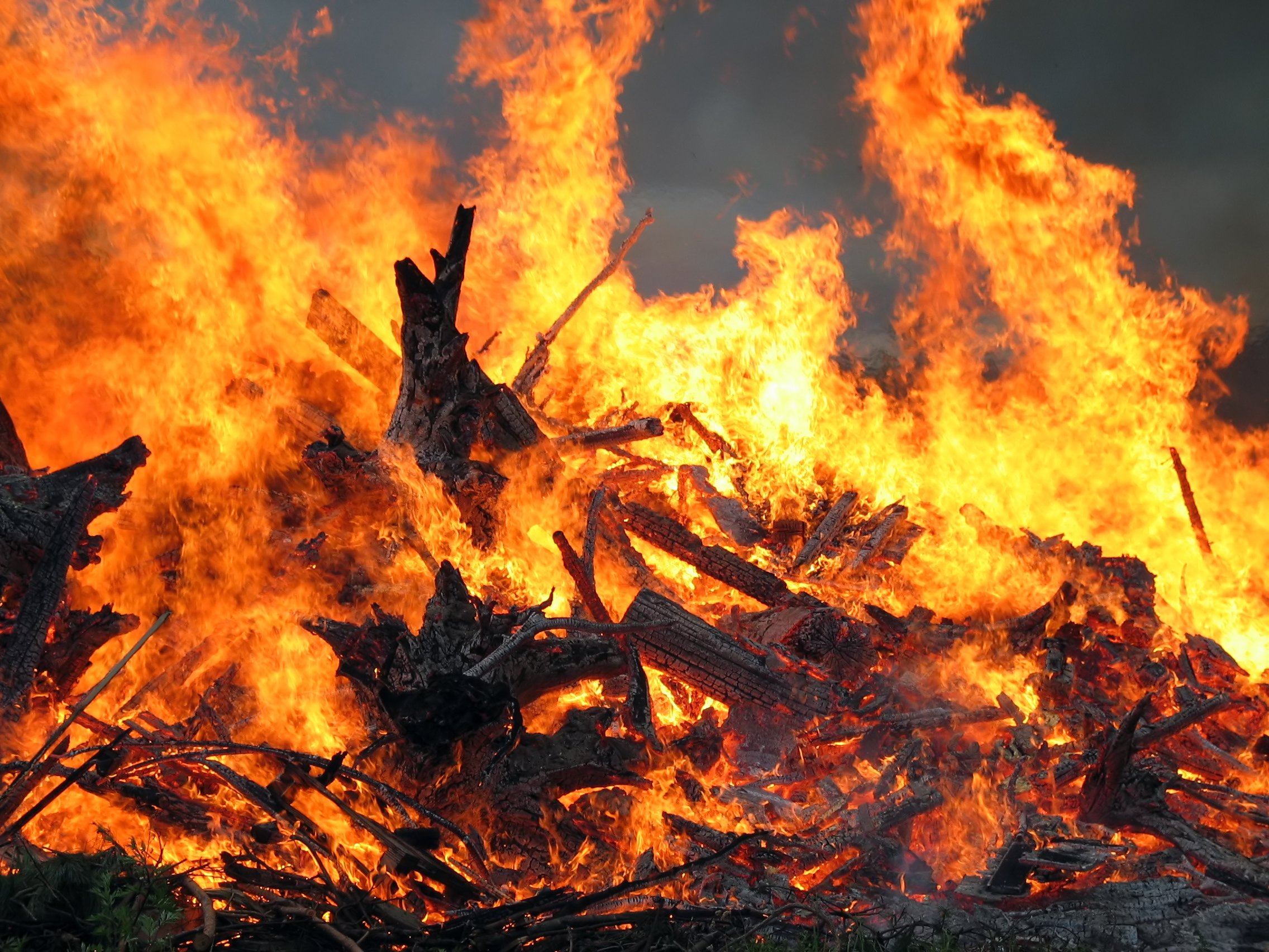
In my ongoing efforts to train myself both on the Mac and with Adobe CS3, I assigned myself a project. Arising from a discussion on Facebook, I decided to create an image of a good book burning. Naturally, I'd pick books from the likes of Sean Hannity, Laura Schlessinger, Ann Coulter, Rush Limbaugh, Mark Levin, Jonah Goldberg, Bill O'Reilly, Karl Rove and the like. First, I had to find an image of a bonfire:
Then, I needed some images of books. So far, so good, so easy. Although, I must say, doing this in Corel Photo-Paint X3 (my self-taught image editor of choice) is more intuitive for me. With Corel, all I have to do when I find an online image is press Ctrl+C to copy it, then in Corel press Ctrl+Shift+N to open the new image. In PhotoShop, I can't find the "paste new image" feature, so I saved each online image and opened them in PhotoShop.
Next, I had to mask each book to remove its background. This is something I learned over the years in Corel through trial and error. While the tools in PhotoShop are similar, I found that it was nowhere near as intuitive, and nowhere near as fast. I'll concede that I did not use tutorials or a "For Dummies" book. I just tried to figure it out myself, something that has served me well in Corel. Clearly, I may have to get a "how to" book after all (and man I hate following instructions!).
Next, I had to paste each masked book onto the bonfire, and then size, rotate and skew them to make it look like they're scattered around. This caused much frustration. In Photo-Paint, selecting, skewing and changing individual pasted objects is child's play. . .simple and easy. In PhotoShop, I found that I had to navigate menus, palettes, right-clicks and layers. It was excruciatingly frustrating. Applying changes vexed me, and I found the only way to easily accomplish the task was to change tools, and wait for the "apply changes?" prompt.
After playing around with all of these images for close to two hours, this is the result I came up with:
It's pretty much what I was going for, but looks like what it is: a bunch of pasted books in front of a bonfire. After all the time I spent, I was disappointed. And I wanted a better image for the blog. So, I came into the PC I'm so much more familiar with, opened Corel Photo-Paint, and started from scratch. Well, almost scratch. I found that I can semi-successfully network the Mac to the PC (it's inconsistent, and does not work as easily as all the "switching to Mac" books say it is), so all of my original images could be imported without looking for them again.
I opened each book image, and the bonfire. In Photo-Paint, I re-masked all the books, pasted them into the bonfire image, rotated, skewed and sized them. I brushed out some of the edges of the book to let the background peek through. I added flames with the image sprayer tool. In short, I got a much better, much more realistic image, and I completed it in about 15 minutes!
Now, I'm not saying that either image is a masterpiece. My intent wasn't for extreme photo-realism, just basically a political cartoon. I spend enough time on the computer as it is, and most of my created-for-blog images are quickies. But so far, this process is so much easier and faster on my PC, I can already tell that teaching myself Adobe CS3 on the Mac is going to be an arduous slog.
This clutter hurts my brain, and frustrates me no end. I'm sure there are second-nature cures for much of this (if you're a seasoned Mac user), but making all of that go away is not intuitive. And I'll bet there isn't a Mac setting to put a containing window behind all of those palettes. If you look at my two screen shots here, you can see an example of the clutter on the Mac, and the nice, open, clean workspace on the PC. But it goes beyond that really. What I want is a feature that Corel has had for years. If you're an Adobe user crossing over to Corel, you can quickly change the layout to emulate Adobe, lickety-split. The whole layout changes to look just like you were using PhotoShop (or Illustrator, if you're using CorelDraw). Adobe could give the Corel-using artist an enormous leg up by returning the favor.
So, my self tutelage continues. It is clear that I'm going to need to get some lesson-teaching books if I don't want to go crazy. But that in itself is gonna drive me nuts. I'm too many years along to be learning my ABCs and 123s. Imagine wanting to learn algebra, but being forced to start with 1st-grade addition and subtraction, and working your way up. Ugh. This is not as fun as I thought it would be.
Then, I needed some images of books. So far, so good, so easy. Although, I must say, doing this in Corel Photo-Paint X3 (my self-taught image editor of choice) is more intuitive for me. With Corel, all I have to do when I find an online image is press Ctrl+C to copy it, then in Corel press Ctrl+Shift+N to open the new image. In PhotoShop, I can't find the "paste new image" feature, so I saved each online image and opened them in PhotoShop.
Next, I had to mask each book to remove its background. This is something I learned over the years in Corel through trial and error. While the tools in PhotoShop are similar, I found that it was nowhere near as intuitive, and nowhere near as fast. I'll concede that I did not use tutorials or a "For Dummies" book. I just tried to figure it out myself, something that has served me well in Corel. Clearly, I may have to get a "how to" book after all (and man I hate following instructions!).
Next, I had to paste each masked book onto the bonfire, and then size, rotate and skew them to make it look like they're scattered around. This caused much frustration. In Photo-Paint, selecting, skewing and changing individual pasted objects is child's play. . .simple and easy. In PhotoShop, I found that I had to navigate menus, palettes, right-clicks and layers. It was excruciatingly frustrating. Applying changes vexed me, and I found the only way to easily accomplish the task was to change tools, and wait for the "apply changes?" prompt.
After playing around with all of these images for close to two hours, this is the result I came up with:
| Final image, created on Mac PowerBook with PhotoShop (Click to embiggen) |
I opened each book image, and the bonfire. In Photo-Paint, I re-masked all the books, pasted them into the bonfire image, rotated, skewed and sized them. I brushed out some of the edges of the book to let the background peek through. I added flames with the image sprayer tool. In short, I got a much better, much more realistic image, and I completed it in about 15 minutes!
![]() |
| Final image created in Corel Photo-Paint on my PC (Click to embiggen) |
| Screen Shot of Mac Desktop During Project |
Part of the problem is the whole layout of each program, and the fact that I've gotten so used to the Microsoft Windows way of doing things. That, and the fact that Corel has such dynamic, easy-to-use tools. In Corel, every tool you pick opens a dynamic toolbar, with all settings available at your fingertips. Adobe uses palettes (which Corel has if you want them, but they dock nicely to the edge of the screen, and stay out of your way), which litter the screen, and distract my eye. Also, Windows programs can be zoomed to full-screen, blotting out all other open programs. Each program can take sole focus, acting as a container for only what you're working on. On the Macintosh, windows overlap, with no containing boundary. So, if you have a web browser open, it is visible under all of your Adobe palettes, your open image window, everything.
![]() |
| Windows 7 Sceen Shot During Project |
So, my self tutelage continues. It is clear that I'm going to need to get some lesson-teaching books if I don't want to go crazy. But that in itself is gonna drive me nuts. I'm too many years along to be learning my ABCs and 123s. Imagine wanting to learn algebra, but being forced to start with 1st-grade addition and subtraction, and working your way up. Ugh. This is not as fun as I thought it would be.
Monday, September 6, 2010
One Reason Why Jan Brewer Gives Me the Creeps
![]() |
| Gul Angle? |
Posted at
Monday, September 06, 2010
by
James Greenlee
Labels:
2010 Election,
Arizona,
Fun with photoshop,
Star Trek
Saturday, August 7, 2010
Fun With PhotoShop: 2011 Retro Cars
Okay, I really should call this Fun With Photo-Paint, since I use the CorelDRAW suite on my PC (at least until my Mac laptop arrives and broadens my horizons). I also should call it half-assed edition, since I started this little project with enthusiasm only to realize that my idea might be a little beyond my skill set (for now!).
Last week, I did a mock-up of my 2009 Mitsubishi Galant, with a (much more sporty) Mitsubishi Lancer nose grafted onto it. It reminded me, that back in the day of the big SUVs, I'd always wanted to mock-up an old Ford Pinto with all of the styling cues of the Ford Explorer, Expedition, Excursion and Escape. It would of course be called the Ford Exploder. Since that germ of an idea, SUVs aren't nearly as ubiquitous, and Ford's styling isn't quite as iconic as it used to be. The brand new Ford Explorer sort of apes the Ford Flex, rather than setting its own style. Anyway, aftter the Exploder idea, I also thought it would be funny to see some of the lesser lights of the 1970s be reborn in the fashion of the Ford Mustang, the Chrysler PT Cruiser and the Volkswagen New Beetle.
Here are two of those ideas, though like I said, I didn't spend a huge amount of time on them once I realized this was going to be tough to pull off well. But it's still sort of fun! When my Mac arrives, I'm going to need the PhotoShop practice, so I may tackle the Dodge Omni. So many car lines have died out though, some great ones--say the AMC Pacer or Gremlin--would be a little trickier to execute.
| 2009 Mitsubishi Galant with Lancer Evolution nose |
![]() |
| 2011 Ford Pinto |
![]() |
| 2011 Chevrolet Chevette |
One weird thing I noticed about these two cars is that their hoods are gigantically long compared to today's smaller cars. This gives the Chevy Chevette a droopy-mouthed appearance when you graft a 2011 Aveo nose onto it. On the Pinto, I used a 2010 Ford Explorer, harkening back to my Ford Exploder idea. It worked, I think, though I ran out of gas before I got to extending the red rocker panels to the bumper. The funny thing is, however "grafted on" these 'shop jobs look, the real front end of that Pinto is a collision of lines and planes that itself looks like a bad PhotoShop job!
(Click pictures to embiggen!)
Posted at
Saturday, August 07, 2010
by
James Greenlee
Labels:
Cars,
Chevrolet,
Dodge,
Ford,
Fun with photoshop
Sunday, August 1, 2010
Fun With PhotoShop: Whitney Houston
I don't know why the tabloid is focusing on Whitney Houston's eating binge. I'm much more concerned about her third hand.
Source: PhotoShop Disasters
Posted at
Sunday, August 01, 2010
by
James Greenlee
Labels:
Fun with photoshop,
Photoshop Fun,
Tabloid News,
Tabloids
Sunday, July 25, 2010
The Evolution of the Mitsubishi Galant (Fun With PhotoShop)
Last February, I traded in my old 1998 Jeep Wrangler after nine years, for a slightly used 2009 Mitsubishi Galant. Ever since, almost every time I spy another car like mine, it's an older model. Something about the original version of my car's current series just strikes me as ugly.
If you know much about cars, you know that every four or six years, if a car is selling well enough, the manufacturer releases an "all new" series with the same name. Sometimes, the new version resembles the old in some way, and usually it stays in the same size class. Other times, the car changes sizes, appearance, and might even change from a compact to a mid-size. But there's another way to change a car, without going "all new." Usually, in the lifespan of any series, the car will get a "refresh" or a "face-lift." This usually involves changing headlamps, taillights, bumpers, and even sometimes fenders, trunks and hoods. While essentially the same car, these new additions can drastically change the appearance of the car.
This is the case with the Mitsubishi Galant. In 2003--as a 2004 model year--an all new Galant was introduced, moving the car from compact to mid-size. At the time, Mitsubishi was trying to go for a "family brand"-look, putting a schnoz in the middle of the grille. I don't think I'm alone in thinking it was a design mistake. Take a look:
This car looks best in red, so this is the prettiest glamor shot of it I could find. In other colors, it looks drab and kinda ugly. Somebody at Mitsubishi must've thought so too, because in 2007, they kept the same car, but gave it a face lift. Gone is the nose, but remnants of it remained. The hood still had style lines that pointed to where the nose should be, and the new replacement grille still had a bulge:
Not really much of an improvement, but better for sure. Somebody must've thought they weren't quite there yet, but there must've been enough life left in the Galant for them to try again. In 2009, they changed the hood, the grille, and the bumper. All remnants of the schnoz are gone, though--curiously--they never changed the headlamps:
If you know much about cars, you know that every four or six years, if a car is selling well enough, the manufacturer releases an "all new" series with the same name. Sometimes, the new version resembles the old in some way, and usually it stays in the same size class. Other times, the car changes sizes, appearance, and might even change from a compact to a mid-size. But there's another way to change a car, without going "all new." Usually, in the lifespan of any series, the car will get a "refresh" or a "face-lift." This usually involves changing headlamps, taillights, bumpers, and even sometimes fenders, trunks and hoods. While essentially the same car, these new additions can drastically change the appearance of the car.
This is the case with the Mitsubishi Galant. In 2003--as a 2004 model year--an all new Galant was introduced, moving the car from compact to mid-size. At the time, Mitsubishi was trying to go for a "family brand"-look, putting a schnoz in the middle of the grille. I don't think I'm alone in thinking it was a design mistake. Take a look:
This car looks best in red, so this is the prettiest glamor shot of it I could find. In other colors, it looks drab and kinda ugly. Somebody at Mitsubishi must've thought so too, because in 2007, they kept the same car, but gave it a face lift. Gone is the nose, but remnants of it remained. The hood still had style lines that pointed to where the nose should be, and the new replacement grille still had a bulge:
Not really much of an improvement, but better for sure. Somebody must've thought they weren't quite there yet, but there must've been enough life left in the Galant for them to try again. In 2009, they changed the hood, the grille, and the bumper. All remnants of the schnoz are gone, though--curiously--they never changed the headlamps:
Also in 2009, they changed the whole back end, replacing pretty much everything, even making the back window larger. Here's a shot I've shown before of my car next to an original series car:
And for comparison, here are both from the front:
While I'm really loving my car, and think it looks pretty great (even better now, with tinted windows), I still think that Mitsubishi missed a golden opportunity here. And now that the car has gone through seven model years, there will of course not be a chance. Mitsubishi has ceased production of the Galant, ending with the 2010 year (UPDATE 06/03/12: As of this date, they are still making Galants, with the same platform. Everything is the same, except for a silver mesh grille, and some chrome trim on the side window sills. They keep threatening to kill the Galant, but it is still--nine model years along--being produced). It isn't surprising either. It landed on the "worst sellers" list for the last couple of years, probably due to almost nonexistent promotion. When is the last time you saw a Galant commercial?
But what Mitsubishi does sell is Outlanders. And Lancers. The sporty Lancer Evolution is a runaway hit. It didn't hurt that they came up with a new "family look" for their other cars, featuring an aggressive grille that kinda resembles an old-school Cylon, from the original Battlestar Galactica. I couldn't help thinking, what would my Galant look like if they'd gotten ballsy, and grafted the new look on to the last round of Galants? Well, I'm a graphic artist, so I thought I'd find out. Now, don't be too critical. I spent about seven minutes on this. But I'm telling you, I'd so buy this car!
Posted at
Sunday, July 25, 2010
by
James Greenlee
Monday, May 24, 2010
Frivolity Break: Madonna's Secret Age Cream!
While I watch the--so far fabulous--final episode of Lost, here's a funny little item I found while trying to avoid spoilers. Via Queerty.
Posted at
Monday, May 24, 2010
by
James Greenlee
Labels:
Frivolity Break,
Fun with photoshop,
Madonna,
Photoshop Fun
Subscribe to:
Posts (Atom)