 |
| Bewitched floorplan from Harpie's Bizarre, impossible because some episodes show the sink looking out over a yard. |
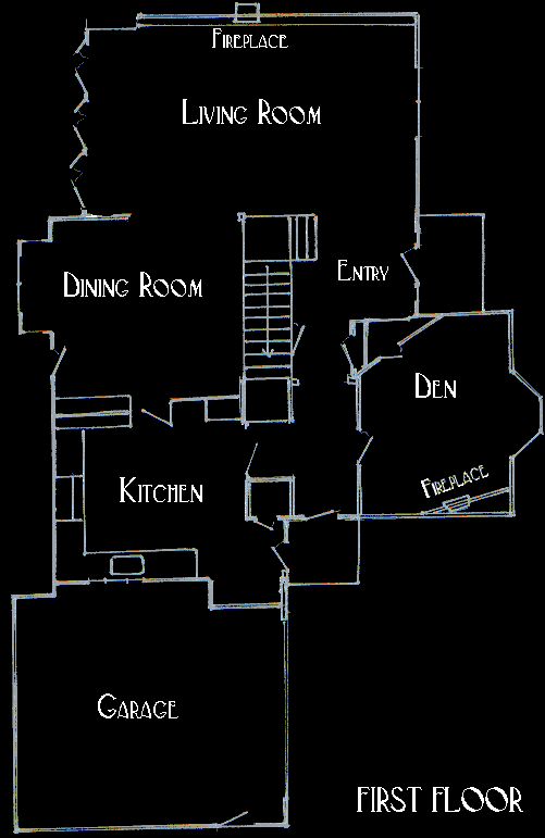
As long ago as the early 70s, I wondered why the house shown at the beginning of All in the Family didn't match the interior floor plan of the house. On the other hand, I also noticed the very well-done floor plan of the the house on Bewitched, and though it may not work 100% on paper, it's close enough to suspend reality. As the years rolled on, this little quirk of mine never went away. The establishing shot of the house on Grace Under Fire seemed preposterously small for the interior. The exterior of the Conner family house on Roseanne was impossible given the living room set. On Seinfeld, the refrigerator would have had to extend into the hallway. And how could The Golden Girls have a garage that shared a space with their bedrooms (not to mention the very short hallway that lead to them).
 |
| Sort of an unlikely apartment in real life. Image from BlogHer |
Some of it you have to willfully ignore, due to the necessity of laying out a stage. Real houses don't flare out like a ball diamond, but on a three-camera sitcom, they have to. Real apartments and homes aren't typically shaped like a gerrymandered Congressional district either, but that is another conceit of set design. And since most sets don't have a fourth wall, there always seems to be an infinite space in front of "the couch" area, where most of us would have a TV. And what about behind the couch, where even in the projects of Good Times, there's plenty of space to walk behind, and often even an unused sitting room (think One Day at a Time, All in the Family).
| One of the many terrific renderings found at HiConsumption |
You can find these renderings all over the internet, but the link below is a treasure trove of high quality imaginings. Check it out.
Source: HiConsumption, via Kenneth in the (212)

No comments:
Post a Comment
Have something to say to us? Post it here!