I've found quite a few web sites out there where I can get lost for hours; Wikipedia, IMDB, I Can Has Cheezburger?, Engrish and FailBlog are just a few. But as a graphic artist who specializes in logo design, I find Brand New (a division of Under Consideration) particularly interesting.
A while back, I linked to them because of a story about Pepsi-Cola's dreadful new "butt-crack" logo design. Since then, I've been checking in every so often to see what brand has gotten a redesign.
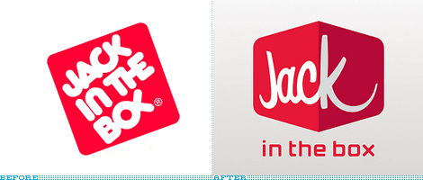
One of the new ones is for Jack in the Box, the west coast regional hamburger chain. Their old logo was very dated, but also kind of cool. The way the letter forms fit together was quite creative, even though the "OX" part looked sort of like a Jesus fish. In fact, I've nicknamed it Jack in the Bejesus because of it. I'm mixed on the new logo. It isn't bad. It isn't great. It's OK. But--as a commenter noted in the replies to the excerpted article--is that a breast subliminally outlined in the extended "K?" Sure looks like it to me!
[Excerpt]
Just Jack
I don't travel much to the West Coast, so my only face-to-face experience with the fast food chain of Jack in the Box is limited to one tasty burger back in the late 1990s and I remember it was quite satisfying. . .
One thing that Jack in the Box hasn't changed is their consistently funny ad campaign, featuring the big-headed clown in a suit. It's been running for 15 years, and though they literally threw Jack under the bus for the Super Bowl ad, they're still going. Check it out.

No comments:
Post a Comment
Have something to say to us? Post it here!