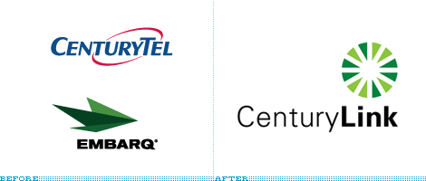
Image from source, Brand New
A couple of years ago, our local phone service went from Sprint to Embarq. I thought Embarq was an interesting name, and I have to admit I really liked the logo. It was sort of a paper airplane design, and I was fortunate enough to have the right color foils in my library at work to depict it without resorting to four-color process printing (which usually produce unacceptable dot patterns on my sign company's equipment).
But now, apparently, Embarq is becoming something new--already. It's changing to CenturyLink. I've got to say, I'm not a fan of either the logo or the name. And I'm only featuring it on the blog because I love the site BrandNew, and because I'm a big fan (and professional designer of) logos. And hey, at least they got rid of the swooshes. See what you think.
[Excerpt]
Visualizing the Link
Still waiting for federal regulatory approval on the transaction of the merger between CenturyTel and Embarq — two telecommunication companies that, together, will bring together more than two million broadband customers (you can learn more about what they each do here) — the combined entity has announced their new name, CenturyLink.
Read more at: Brand New

No comments:
Post a Comment
Have something to say to us? Post it here!